
Seaboard 2.0
Norfolk, Virginia
Seaboard 2.0 has been such an interesting house flip for us. First of all, I don’t want to forget to celebrate that we have entered DOUBLE DIGITS for house flips! We’ve hit the big 10 for full time investment properties since moving to Virginia Beach in 2019.

Seaboard 2.0 received it’s name after becoming our second house flip on Seaboard road in Norfolk, Virginia. The story goes that we got a message on Instagram from a wholesaler who had several houses he was trying to sell. Of course at first I was extremely skeptical, but after viewing the property and running the numbers, Seaboard 2.0 would make sense for us to flip and sell.

I wanted to highlight 3 areas in this house on which I took design “risks.” If you heard our Bigger Pockets Rookie Podcast Episode, we talk about how we take 3 Design Risks in our houses in order to stand out and make a difference in the market ultimately leading to (hopefully) landing a sale sooner rather than later. We try to stay as close to 3 risks as possible when choosing materials and colors so that the home can stand out and make an impression but also not eliminate interest from several homebuyers that may not desire our design choices.
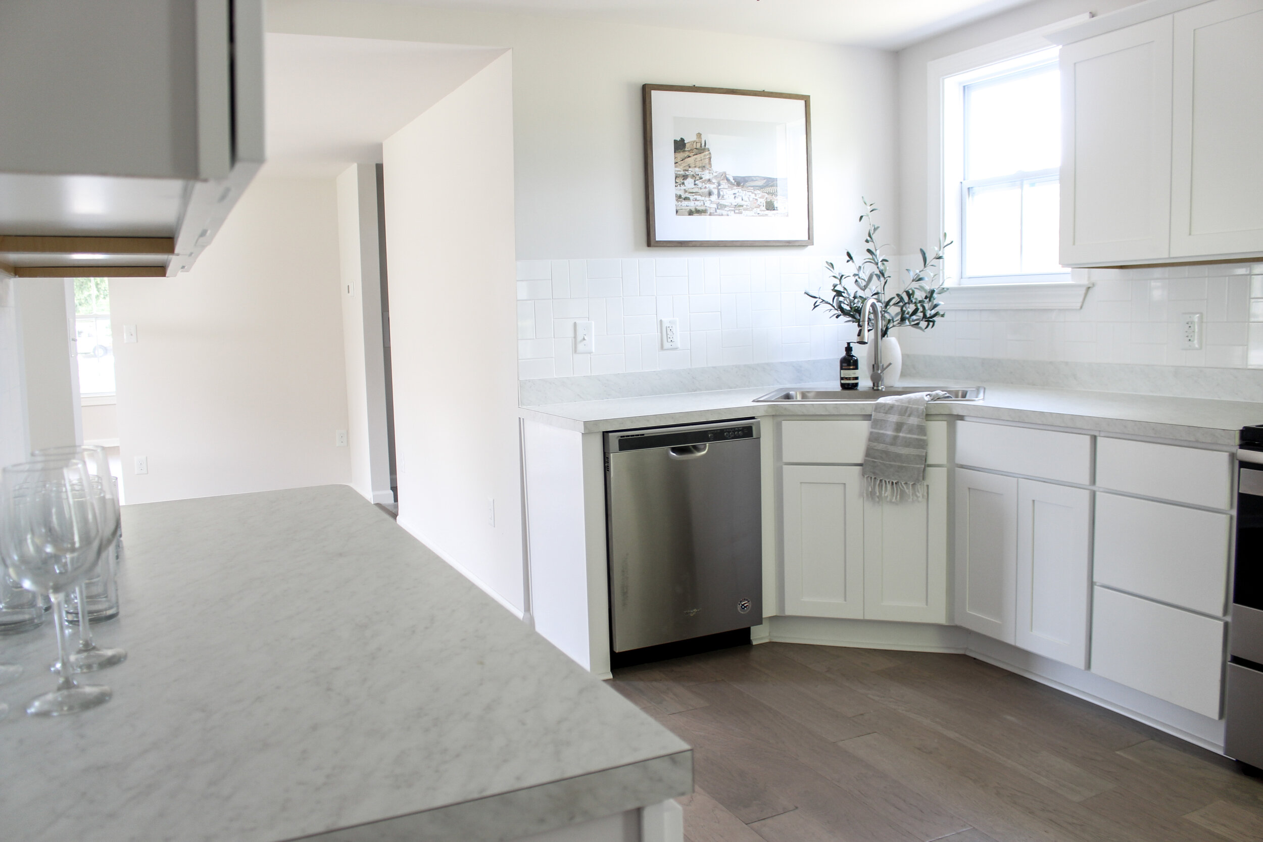
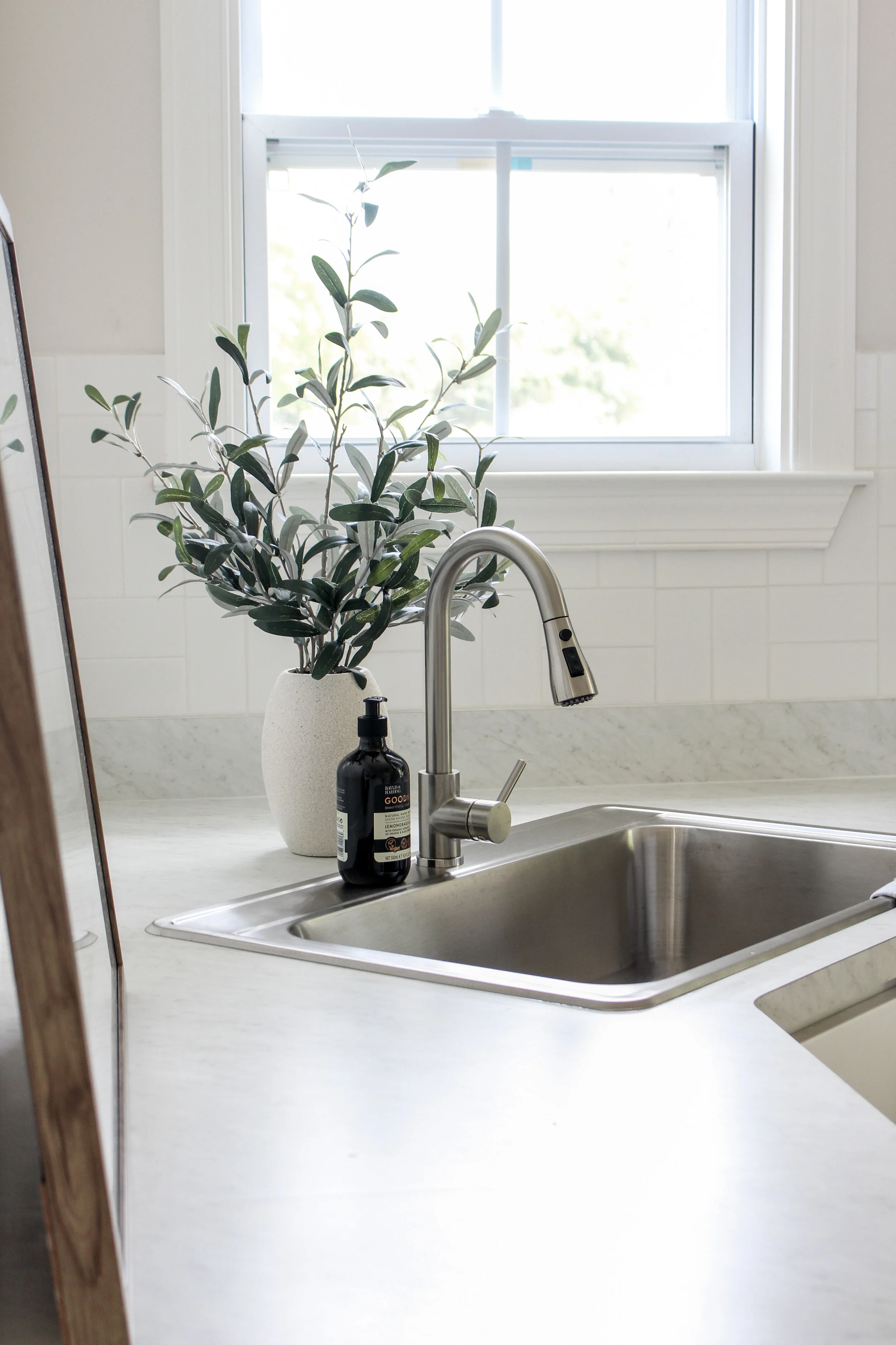
First design risk we took in this house was the basket weave pattern in the backsplash. Typically subway tile is one of the most affordable tiles to use in real estate flipping but installing it into a fun pattern can really take this classic and simple tile to a whole new level. In this kitchen we chose to lay the tile in a two horizontal and two vertical pattern creating a basket weave look. I think it adds character and bit of texture to the walls in a more neutral kitchen color palette.

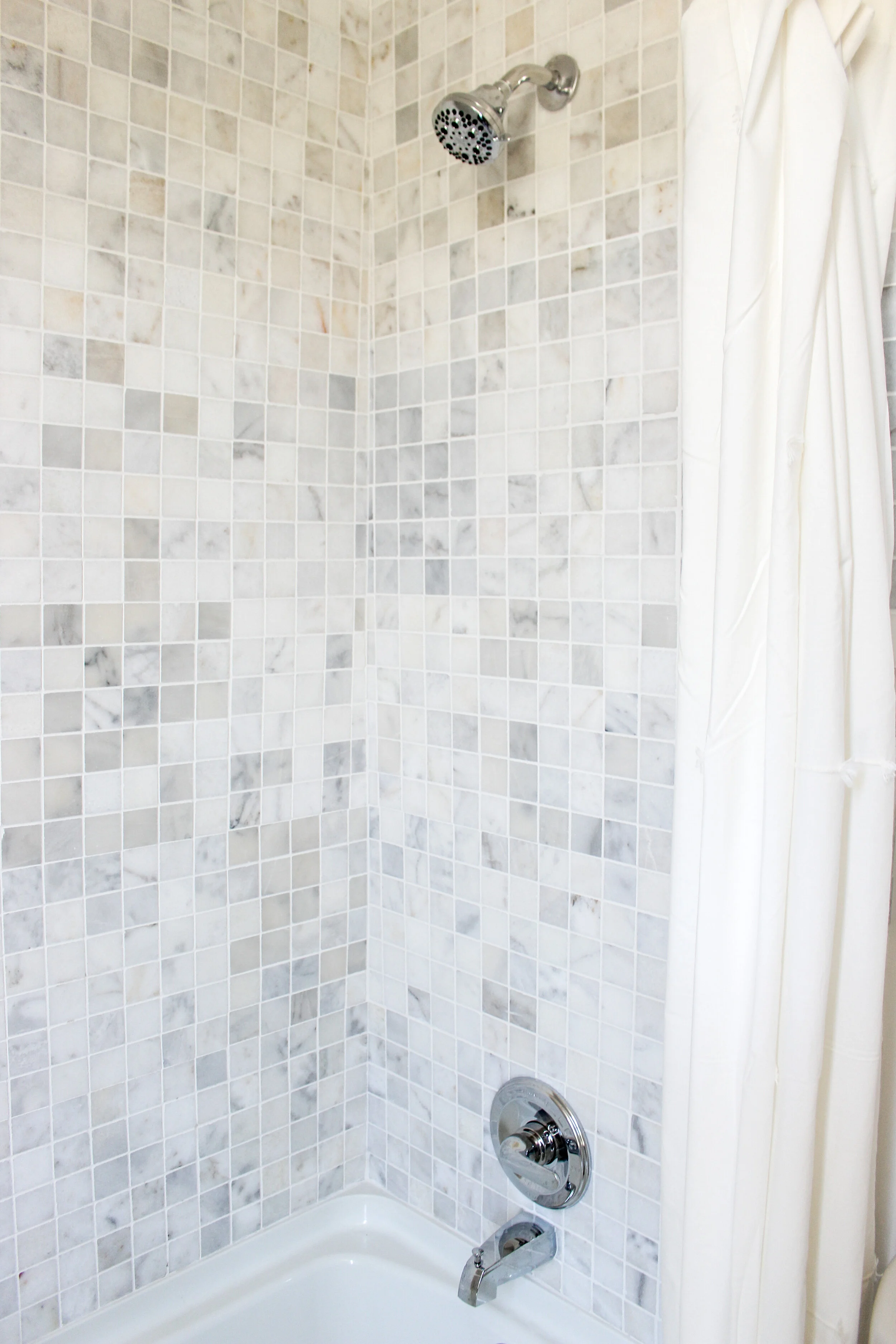
The second risk we took was this fun marble square sheet pattern tile we added to the downstairs bathroom. I love the random “natural stone” colors and the depth it brought to this bathroom. It’s a little less neutral in style and has a bit of flare to it making it one of the “risks” in the house.

I’ve been choosing lots of natural stones and materials in my design recently and it’s a pattern I would like to continue. The earthy grey floor tiles paired perfectly with the cool tones in this fun shower tile.
We like to keep most of our houses as neutral as possible so that they will appeal to the masses and hopefully someone will fall in love with it and make it their new home. The paint on the walls in this house was a warmer white called Toque White by Sherwin Williams.

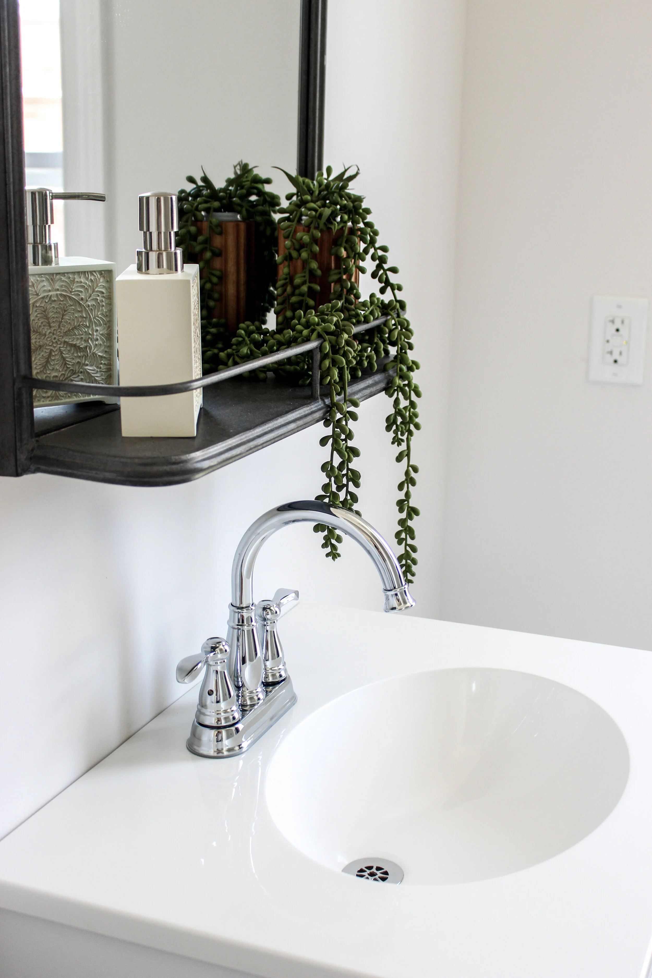
The upstairs bathroom remained neutral as well with the same stone-look tile on the floors that we installed in the downstairs bathroom.

Pro Tip: Always switch out vanity mirrors for a fun mirror with more personality and appeal. This one from Amazon was worth the extra penny since it included a fun ledge for extra storage or decor.
The last design risk in this house was the exciting YELLOW front door color that we chose! Fun fact: it was actually Sean’s idea to make the front door pop and with a yellow color! This yellow is Hubbard Squash by Sherwin Williams. It’s the perfect creamy yellow without being too pastel or too bright.
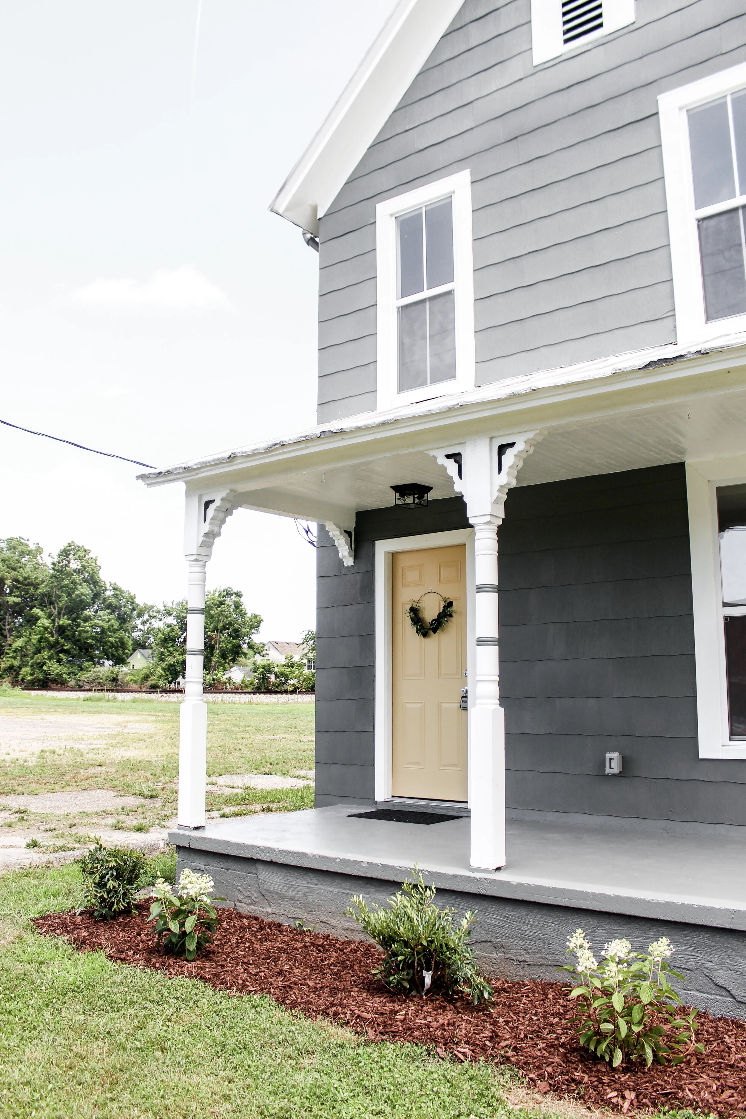
The whole exterior received a “glow up” with all new paint and landscape this finish the two month project. This property was one of the fasted flips we’ve done to date because it was already gutted when we bought it! We didn’t need to lift a finger for any kind of demo work. Our sub contractors came in hot with drywall and mudding and the rest flew after that.
We can’t wait to continue this exciting journey and see what else is coming for us down the pike. Next up: number 11!
Ann | DESIGN