
The Librarian’s Condo: The Library by the Sea
Norfolk, Virginia

We all have those moments in life when all of sudden we step back from whatever we are doing whether it be a performance on stage, a graduation, the end of a basketball or soccer game, or the finishing touch to a creation of ours, and we have that moment where we think, “I did it.” We don’t just think that we did it but we absolutely surpassed what we only dreamed in our mind we could do in real life. It’s the feeling after the swish of a free throw that wins the game by one point. It’s the last bow after you, the lead actor, comes out on stage by yourself under the lights to receive the recognition of your breathtaking performance. It’s the applause after your valedictorian speech that echoes through the halls of the auditorium where not a dry eye is present. It's stepping back and looking at a piece of art that now exists for the whole world to see where it once resided only within your imagination. That feeling is the work of art we created within The Librarian’s Condo.


Sean talks about a personal goal to sell every book from the condo in hopes to make a little more cash and soften the blow of how horrible it was to transport every single book out of there. We have tons of conspiracy theories as to why so many books were left behind. Maybe the original owner was an aspiring book store owner and had been saving up to finally afford a bookshop on the water. Maybe she was an angry librarian whose recent library partnership took a turn for the worst, causing her to reclaim every book she had invested into a deal gone wrong and keeping them safe until another deal came along. Some people think she had to flee quickly from a possible misunderstanding with a group of bad librarians and after figuring out her whereabouts, she managed to escape only to leave the evidence of her old life behind. Either way, Team Wayne got a good deal off her place and maybe by a happy fault, she may find herself reunited with her long, lost treasure trove. But before that happens, she might come check out how her place looks now, starting with the kitchen.

The Kitchen: The Nautical Contrasting Backsplash
I knew immediately when we purchased the condo that I wanted a nautical blue palette within the project. Blue is so wildly appropriate because the property was located on the top floor of a Condominium Building that sat one row back from East Ocean View Beach.

The condo boasts bay and ocean views for miles and has access to the sandy beach directly across the street. This paradise is not only seen from the bedroom windows but also obtained after a few short steps to the beach. My goal within the home was to achieve a beachy feel with a mix of modern accents and a seamless blend of pattern. starting with the kitchen faucet.


The backsplash in the kitchen was the first unwavering style choice I made. I knew I wanted a bold blue to pop against the white of the kitchen cabinets.
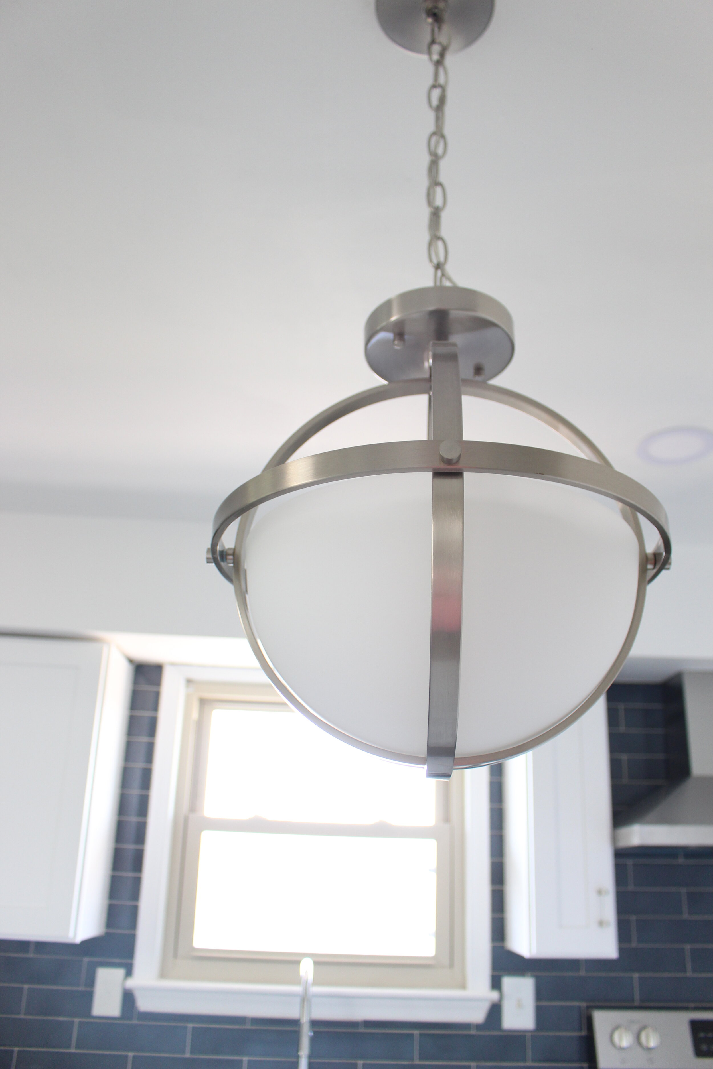
Next, when it was decided that the pantry would be demoed to create room for an eat in kitchen from the peninsula, I knew the pendant that would hang above would have to be striking. This Sea Gull Convertible Light Pendant from Amazon was perfect for the space. The chrome metal of the light was carried out throughout the house and elevated the theme to a touch of elegance and sophistication. The milky glass of the pendant in the kitchen gave me another idea to add a schoolhouse flush mount in the master bedroom in order to head nod back to one another.

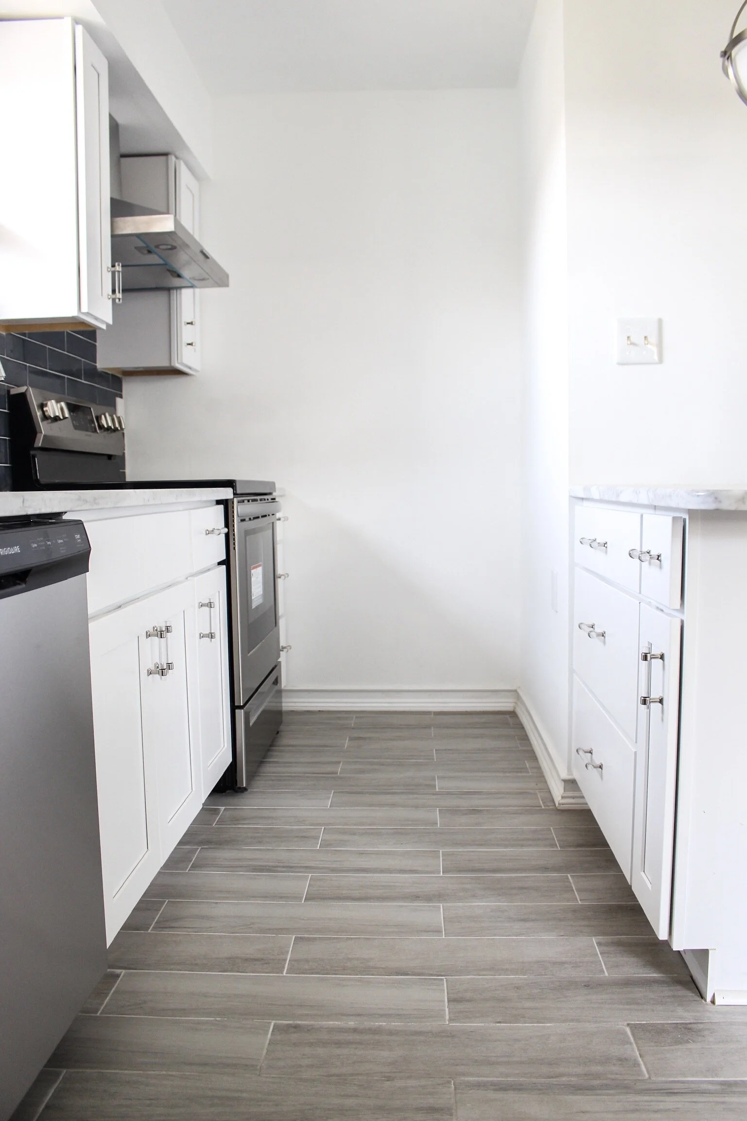
After installing grey and white marble countertops in our own home, we decided to carry on the same trend in the condo. The grey in the marble paired so perfectly with the cool blue of the backsplash.


During one of the last weeks on the project, I stumbled across these chrome and glass cabinet pulls on amazon. Even though they were a little pricey for the project, we had a little wiggle room which gave me the green light to add a finishing touch to an already marvelous kitchen. These pulls are an absolute necessity to the space. They bring a depth to the kitchen that elevates the look to the next level.

This wood look grey sandy tile was installed in the kitchen, ran down the hall, and transitioned into the main bathroom. It was a steal at 80 cents a square foot at Floor and Decor. After buying it online immediately because of the price, I crossed my fingers that it would look just as good in real life. I am happy to report it looked even better with it’s greige tones and beachy reminiscence.

The Main Bathroom: Our Shower Bargain Tile
When we lived with my parents prior to moving to Virginia Beach, we went for a walk through Lowes a few weeks before moving.
We saw a stack of boxes with a large Clearance sign saying “80 Cents.” The tile was a bold, dark grey color with glass-like transparency that surely did not cost 80 cents originally.


We had barely bought our new house and definitely had no flip houses to work on at the time but the price and the tile were just too good to pass up. We bought 80 square feet hoping that would cover whatever unknown project lay ahead and hauled the boxes back to my parent’s house then down south shortly after.

Well, here in the Librarian's Condo was the perfect shower space with a grey/blue palette to match. Tommy, our contractor, completed the project effortlessly within a few short hours and he had quickly finished the master bathroom the night before. Tommy drives 3 hours south to help us with our projects and returns home within single digit days after completion.

We are so grateful for him and loved his kitchen and bathroom flooring jobs he did for us back at the Gilpin Project.


The Living Room: Some Fireplace Lovin’
The living room flowed right off the kitchen allowing for a pretty seamless transition from one space to the other. I knew I wanted a bold chalky, bluish, grey color somewhere in this space to add to the nautical feel of the project.


I found Magnetic Grey by Behr at Home Depot and was smitten immediately. The debate was: dark mood walls and a white fireplace, or white walls with an accented fireplace. My heart really wanted moody walls. The only thing standing in the way was that the room has two windows that didn’t give that much light.

The living room was naturally dark to begin with and the dark blue/grey would only make it more cave-like. An accented fireplace was the latter of the two options and what an accent it was!

The white walls helped to lighten the room and the fireplace became a stand alone focal point in the room. Either contrast would have been incredible but because of the lighting issue, white on the walls ultimately was the better decision.

The Bedrooms and Hallway: So Fresh and So Clean
The bedrooms and hallway got new coats of paint and new carpeting throughout. We immediately became obsessed with Dove by Behr Paint after the first coat in the bedrooms. The neutral color is tan without being yellow and beige with a hint of grey. It’s light and airy but you can still feel it’s presence. My mom even liked it so much that she had my dad apply a fresh coat of Dove to her new sunroom in her own home. The carpet from Home Depot was called Trendy Threads I and brought in tan, brown, other sandy tones. I wanted the contrast of warmth to cool colors in the project and the Dove paint and carpet added the essential warmth it needed.

The Master Bathroom: Patterns for Days


This little condo had an ensuite master bathroom which was a fabulous selling point. To go along with the bonus feature, I wanted this master to be the showstopper.

I had my eye on Starburst (duck feet, whatever you want to call it) cement tile from Floor and Decor for months.

I planned the bathroom remodel around this light blue tile floor. Because the pattern was large, I wanted smaller textures on the shower walls and floor.

The grey penny tile was a marvelous contrast to the mini white herringbone tiles that covered the walls also from Floor and Decor.


The price points were all well under $4 with the exception of the cement starburst tile which was $4.29 a piece (still a great price). The blue tile drew the eyes right to it so in order to keep the limelight on him, the vanity and walls would be white so as to not stand out. The chrome fixtures throughout upgraded the bathroom to a classier feel and was a fitting addiction to the nautical theme.
The Closing: One and Done
The Librarian’s Condo was listed in the very middle of the pandemic. If the condo didn’t sell, our plan was to rent until we could put it back on the market at a better time. Though after crunching the numbers, Sean was not excited about the possibility of renting because the average rent in the area where the condo was located wouldn’t profit us enough to make it a lucrative BRRRR option.


We only had 2 showings in the first 48 hours and only one offer. It didn’t make the decision to accept the only offer on the table difficult when it ended up coming in at full price. We accepted it after a day and provided the buyer with closing assistance. Thus, The Librarian’s Condo: The Condo by the Sea was bought, gutted, flipped, and sold again for a profit that made us happy and all under six weeks.
This project is an incredible addition to our Team Wayne portfolio. It feels almost like a child you birth, mold and help grow into the person she was supposed to be all along. And when she’s ready, she will go off to start a new life of her own with the prayers of her parents to stay far, far away from the library scene.
