Project Gilpin: Our First Virginia Beach Flip
In a way, The Gilpin Project was another “first flip” for us. Even though we had experience flipping previous properties, it was time to write our Virginia Beach story. Gilpin was a test. We had recently moved to the Virginia Beach area and it was time to see if we could float in the market here. We knew we could swim within the Northern Ohio market where we first found success; we built an extraordinary house in Auburn, New York, but would Virginia fare equally as well as our previous home states? We had to rip the bandage some day, and the day had arrived.
With the help of our fantastic realtor, Debra, we acquired the Gilpin House after out bidding a dozen other offers. The Norfolk area of Virginia Beach is extremely up and coming. Norfolk is home to Old Dominion University, Norfolk State University, military and navy bases, and several beach locations fit for vacationing.
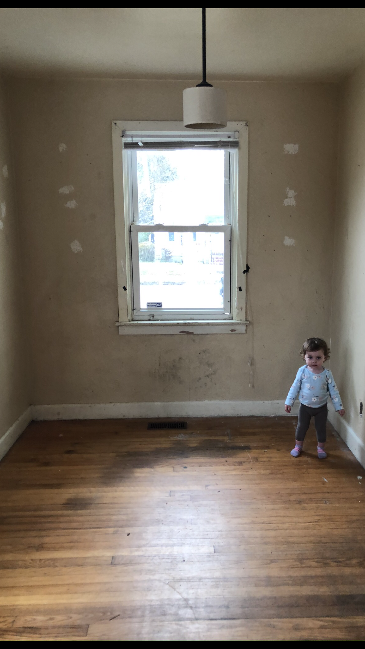
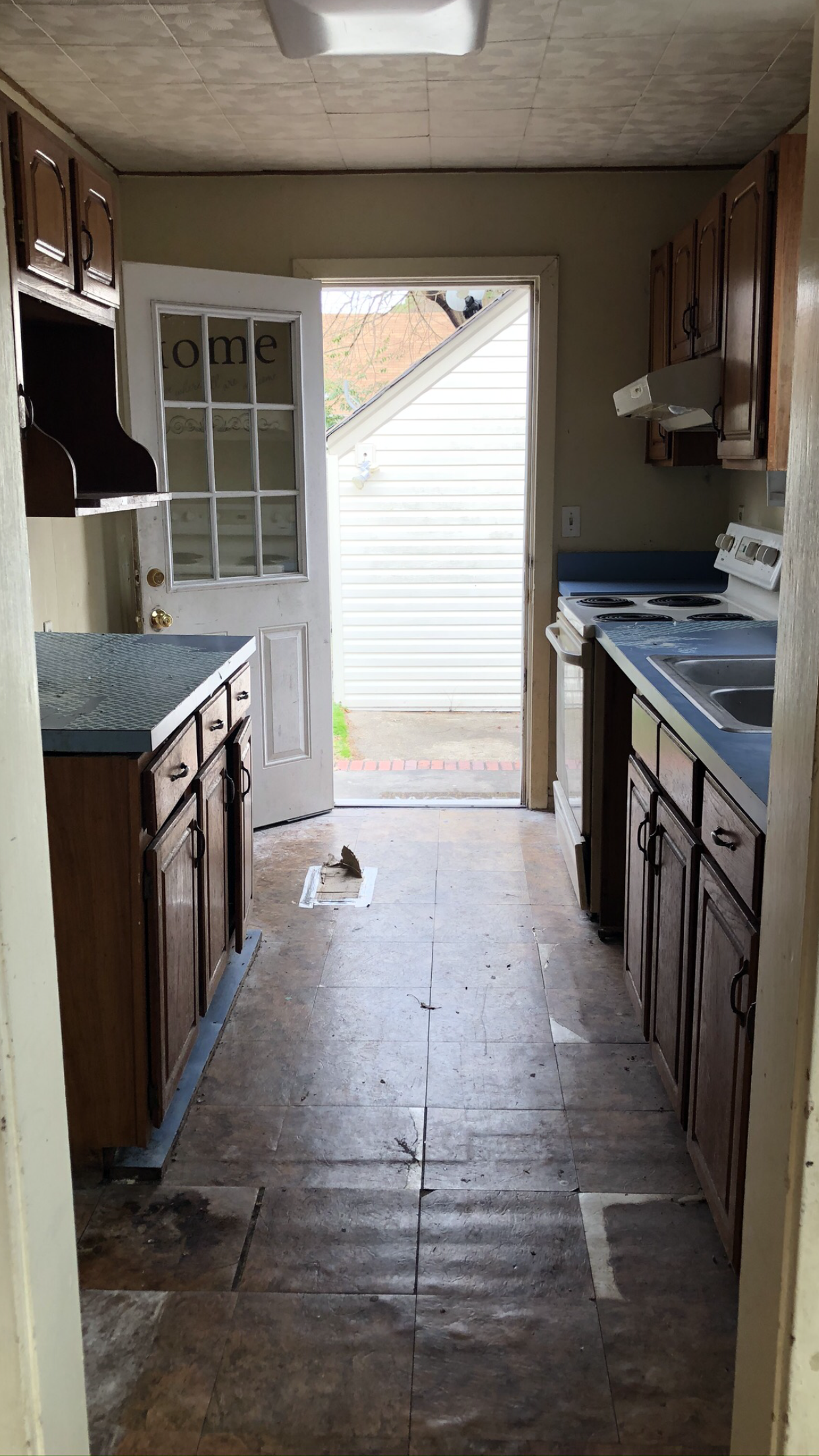
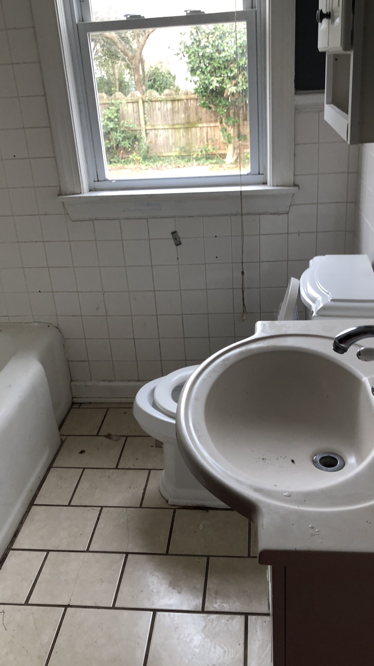
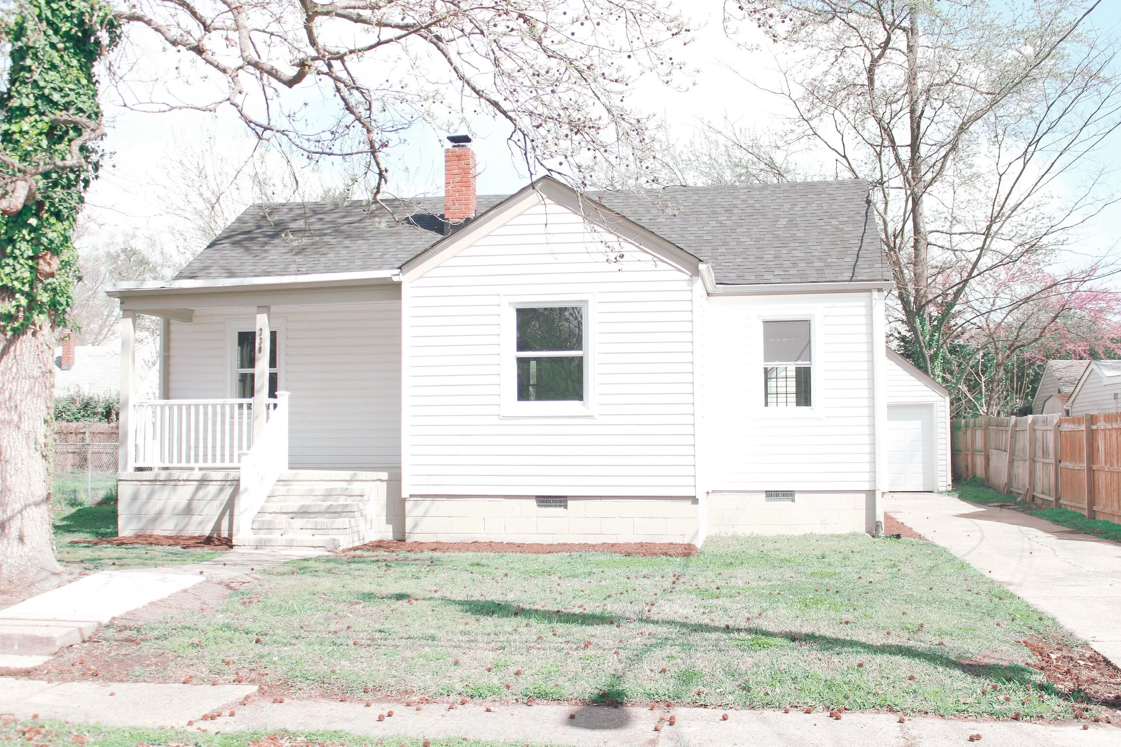
Gilpin was a 928 square foot, one bath, three bedroom home. It had cute, promising curb appeal on the outside and was absolutely tragic on the inside. The owners had adult pit bulls, which in turn had pit bull babies, who then chewed up not only all the duct work underneath the house (discovered mid-demo) but also the entire inside of the house. The neighbors were very liberal about all the information concerning the late homeowners. I pray that wherever they are now, they are not only loving their new house but also taking care of their four legged friends.
Honestly, it’s stories like these that truly make Sean and I feel like we’re fixing up more than just 4 walls and a roof. We ended up accepting an offer after just a few hours after listing. The buyer was moving to be closer to her daughter who was having a baby and flew in for the day to visit our house and consult a second option. After seeing ours, she said she had to have it. This house has since become a place where a grandmother can relax after a long day of cleaning spit up and rocking her grand baby to sleep. Maybe the baby would grow up making cookies with grandma in the very kitchen I designed, where Sean laid the marble backsplash. One day, Grandma may even bring home a puppy of her own to that very house, provide it with love and affection, and keep it away from the brand new $1500 dollar ductwork.
The Kitchen: The Tudor Design Plan
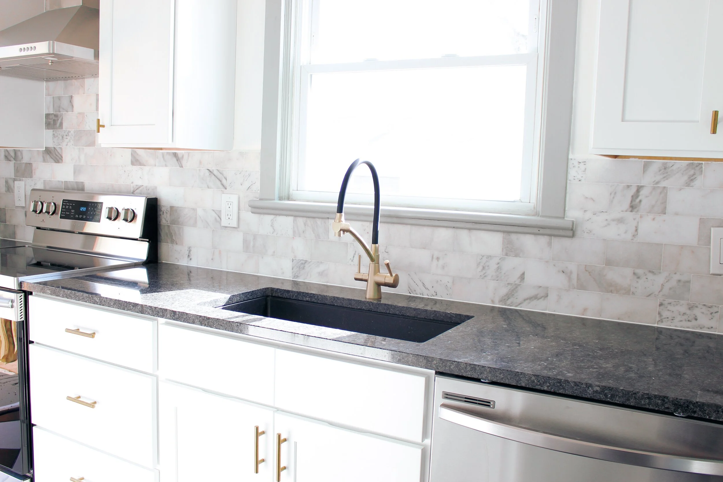
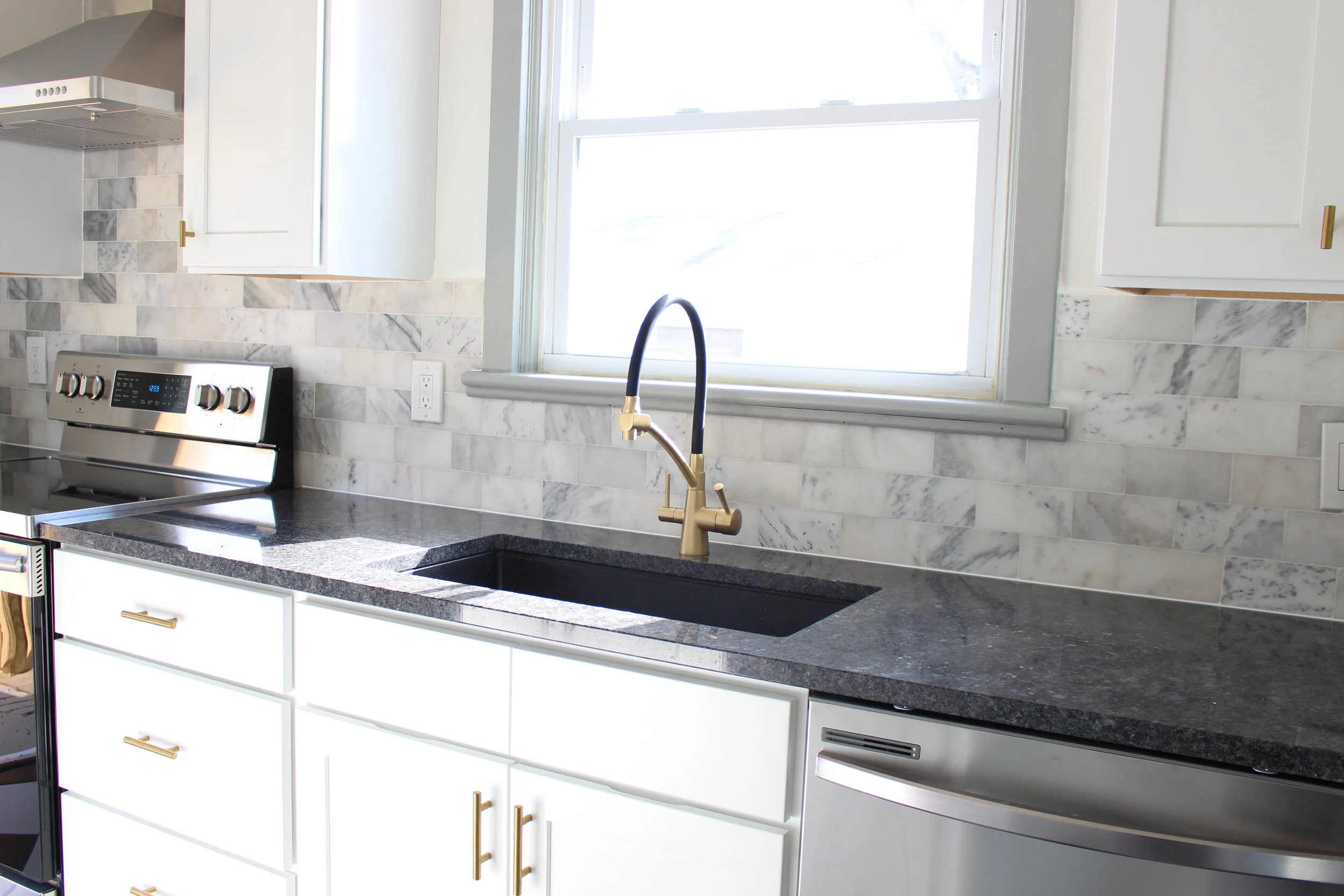
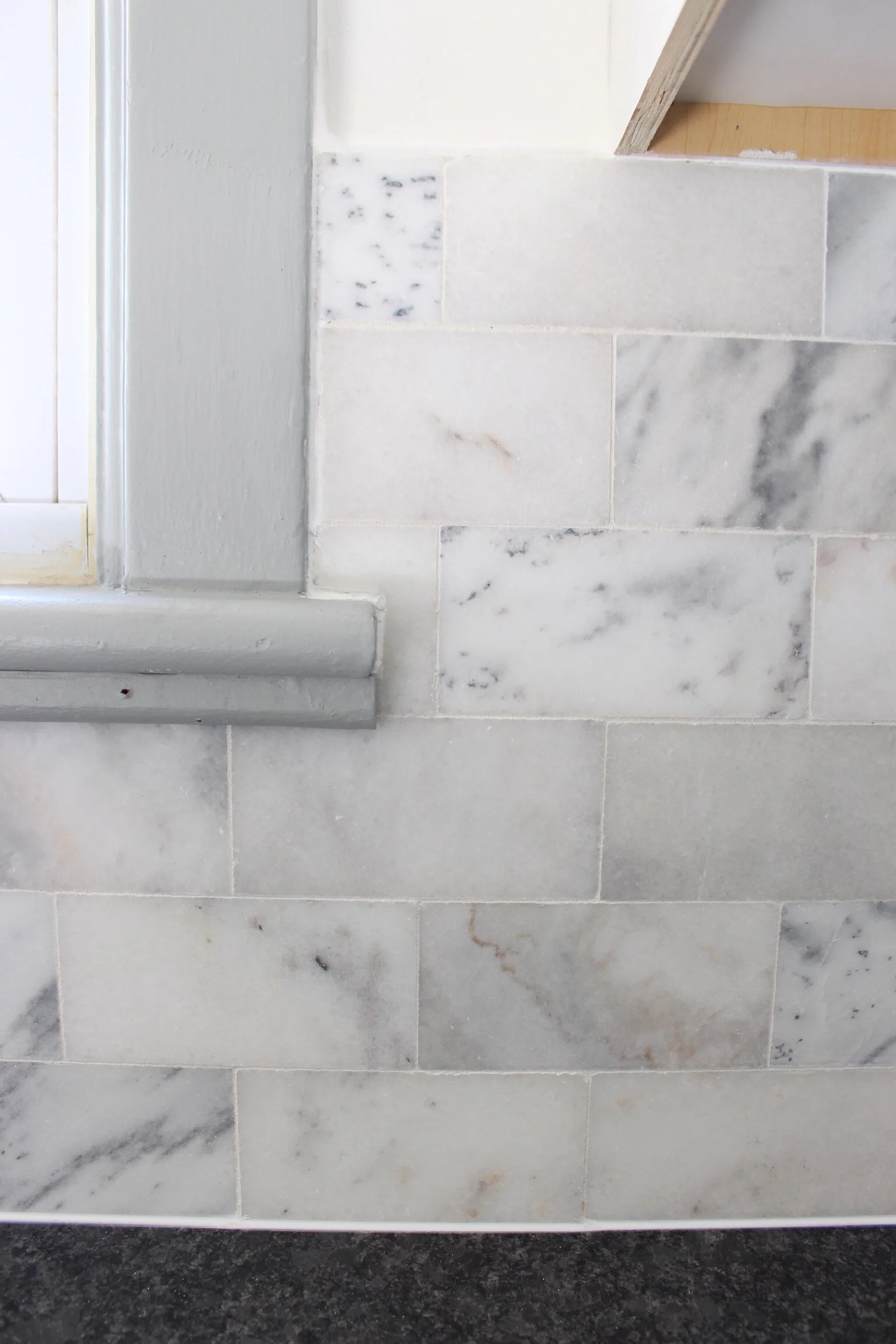
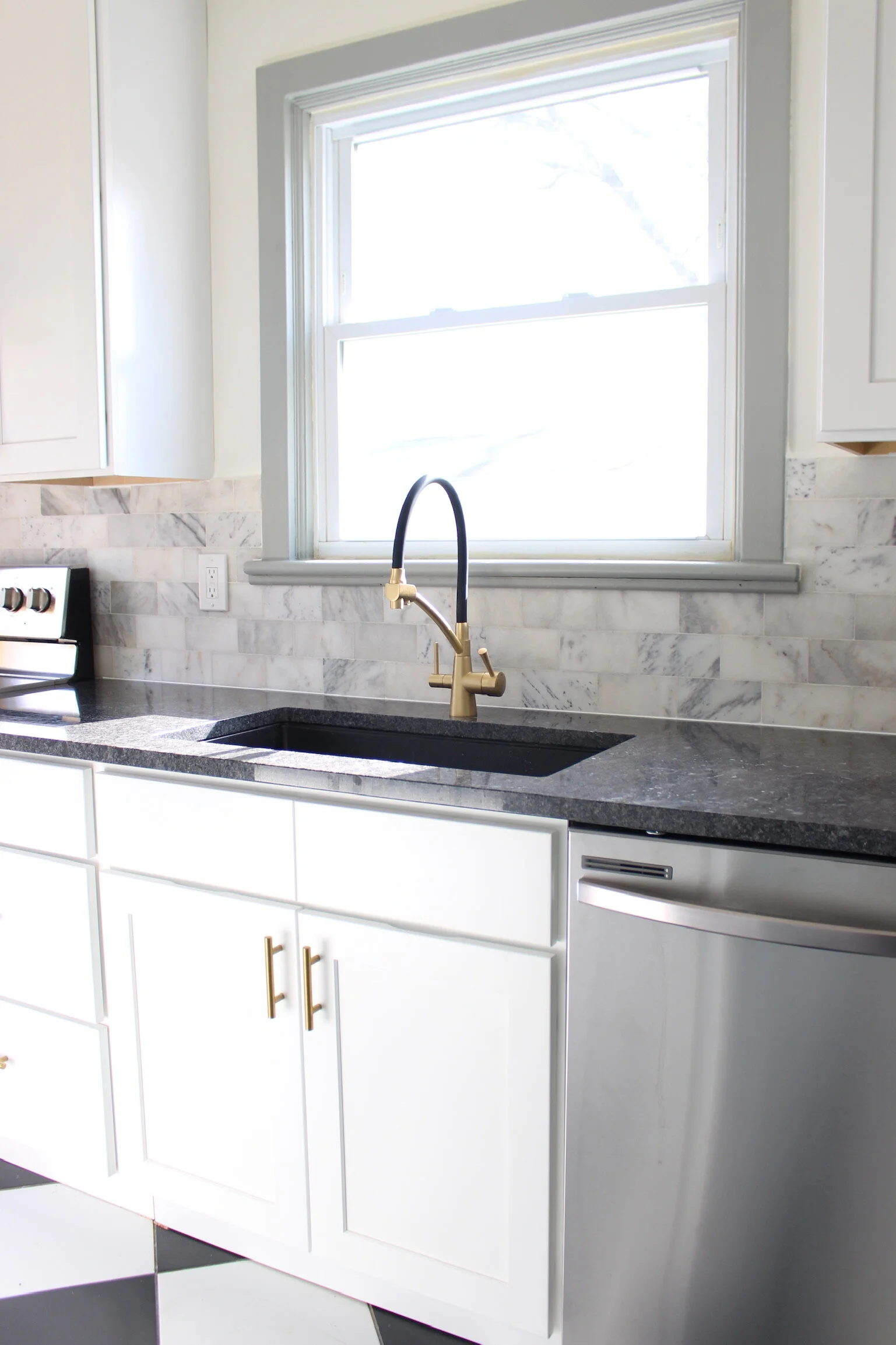
I can’t stop praising Sean’s tile work enough in this space. This was his very first attempt at installing both marble tile and a backsplash. He completed the shower and bathroom tile before finishing the kitchen work, but I swear he did a better job than some other professionals. His attention to detail is an absolute gift in this line of work. He isn’t satisfied with subpar results, and repeats the process over and over until he is satisfied and proud…only one of the many reasons I love him so much.
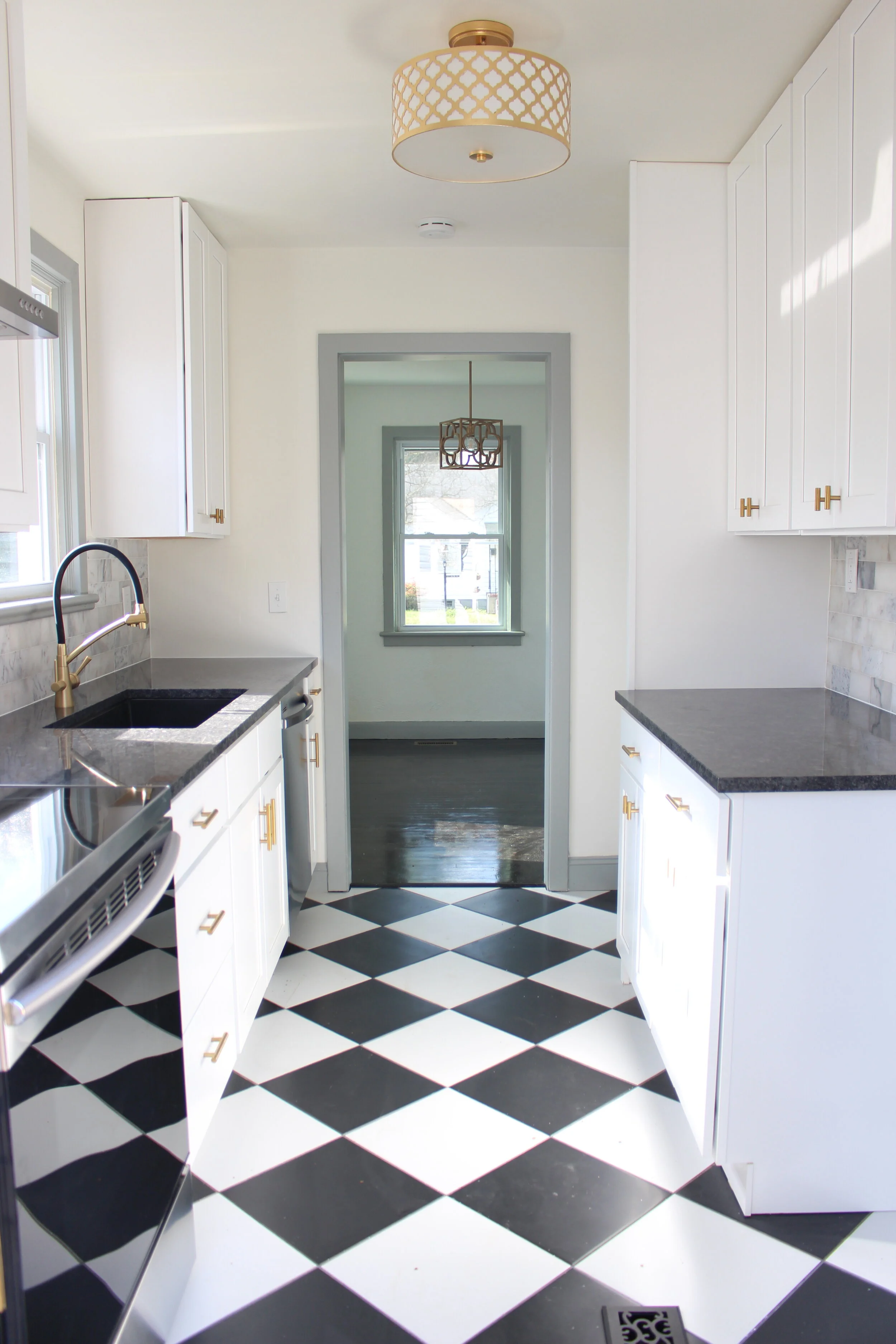
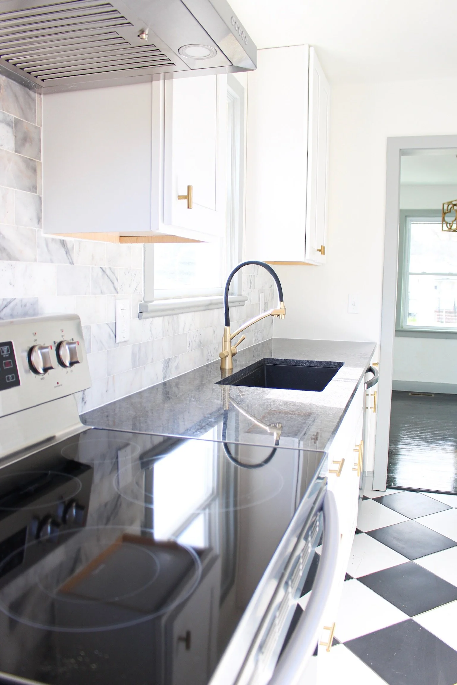
The countertops were the closest shade to black granite that Lowe’s was offering at the time. It was called “Charcoal Grey”, but it was definitely more black than charcoal. My goal was to pick up on the black diamond check floor pattern that I chose for the floor.
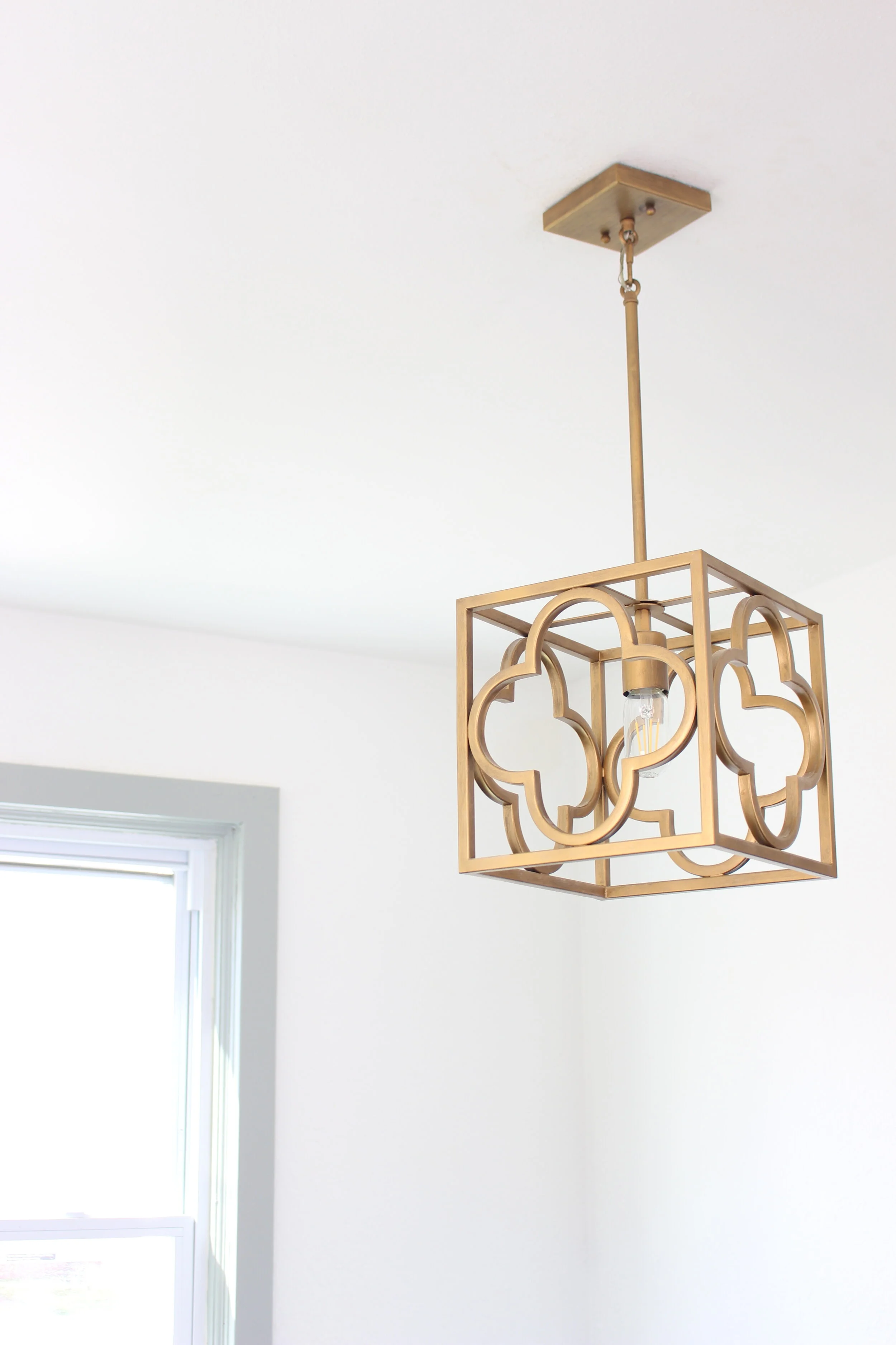
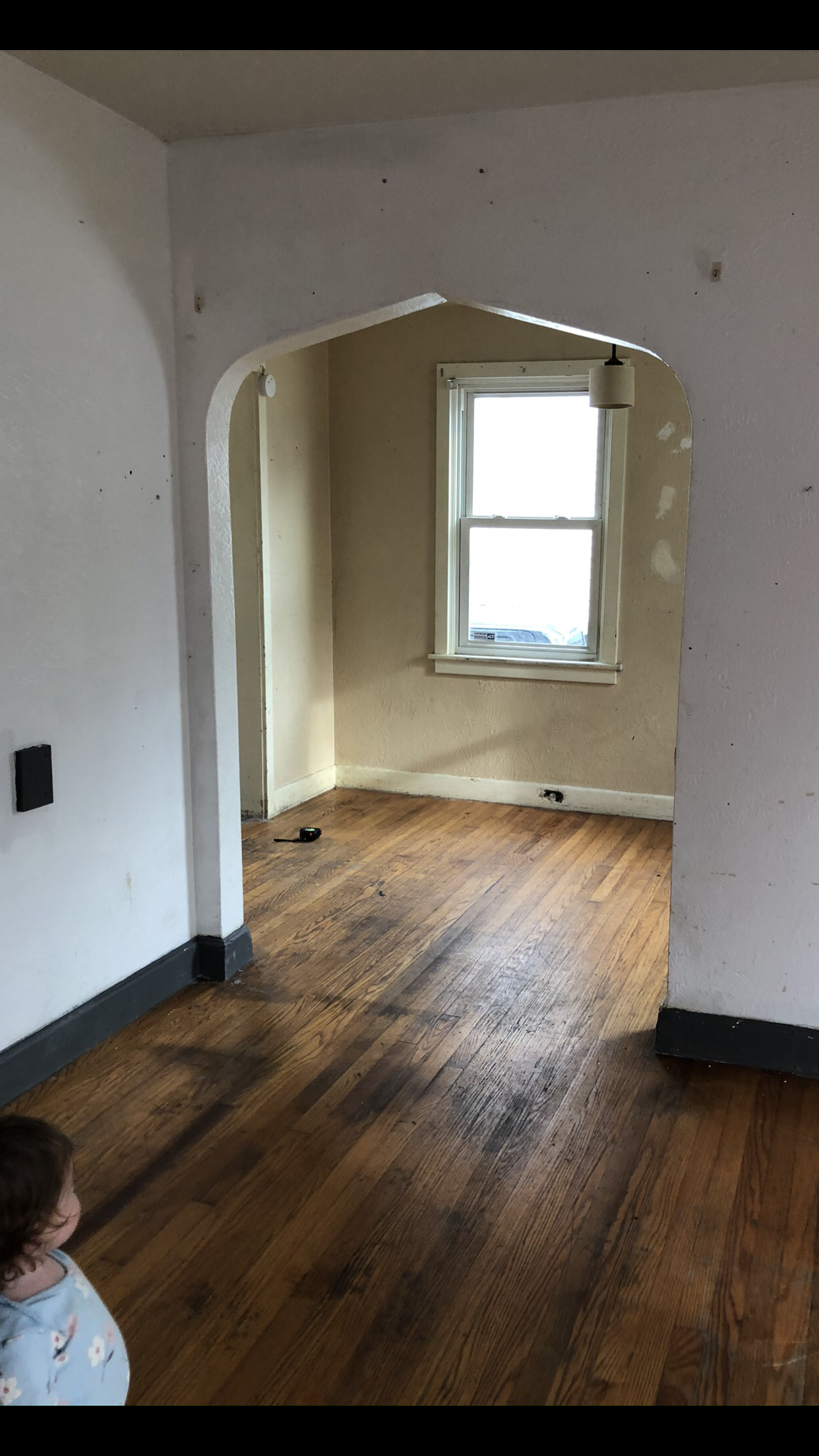
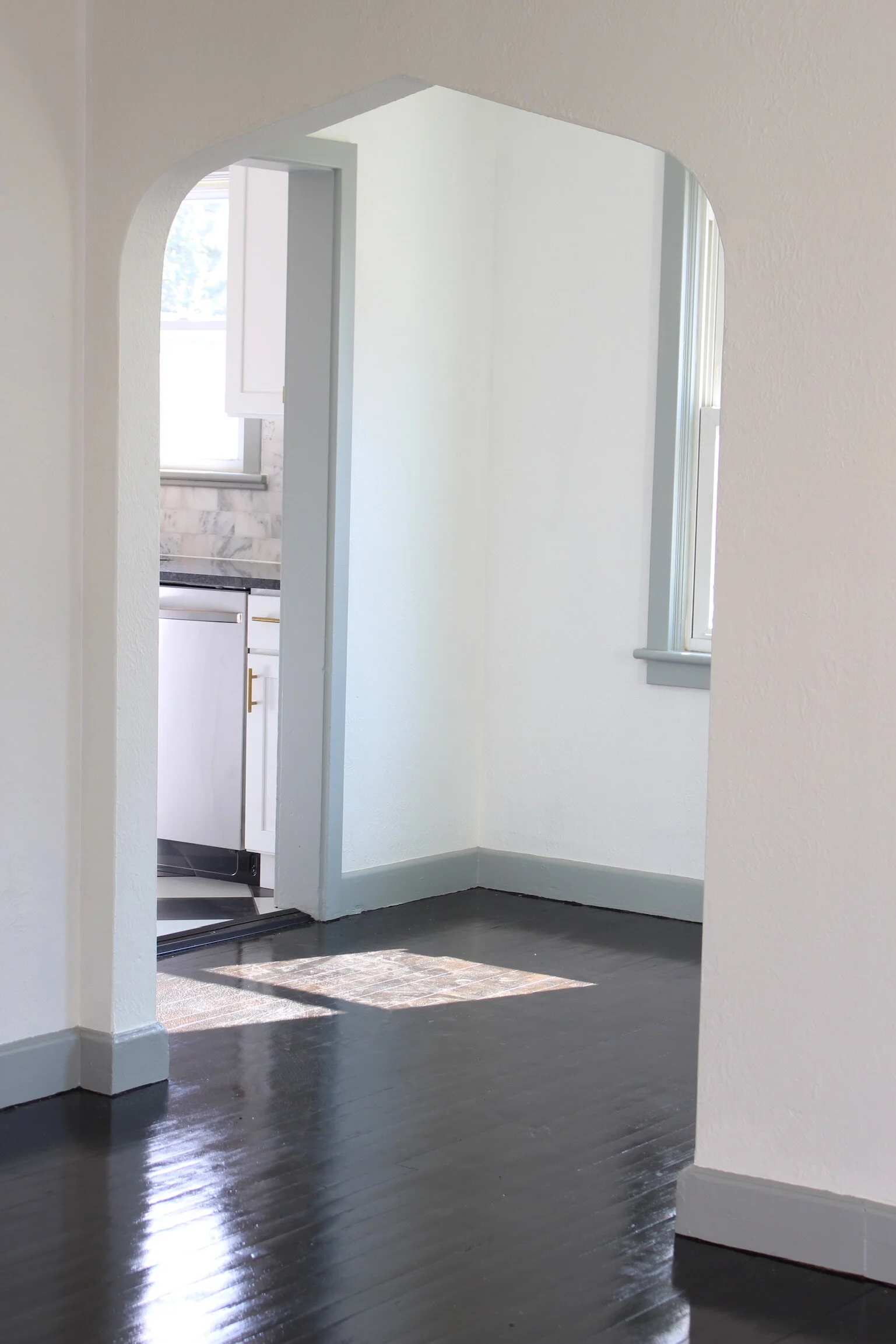
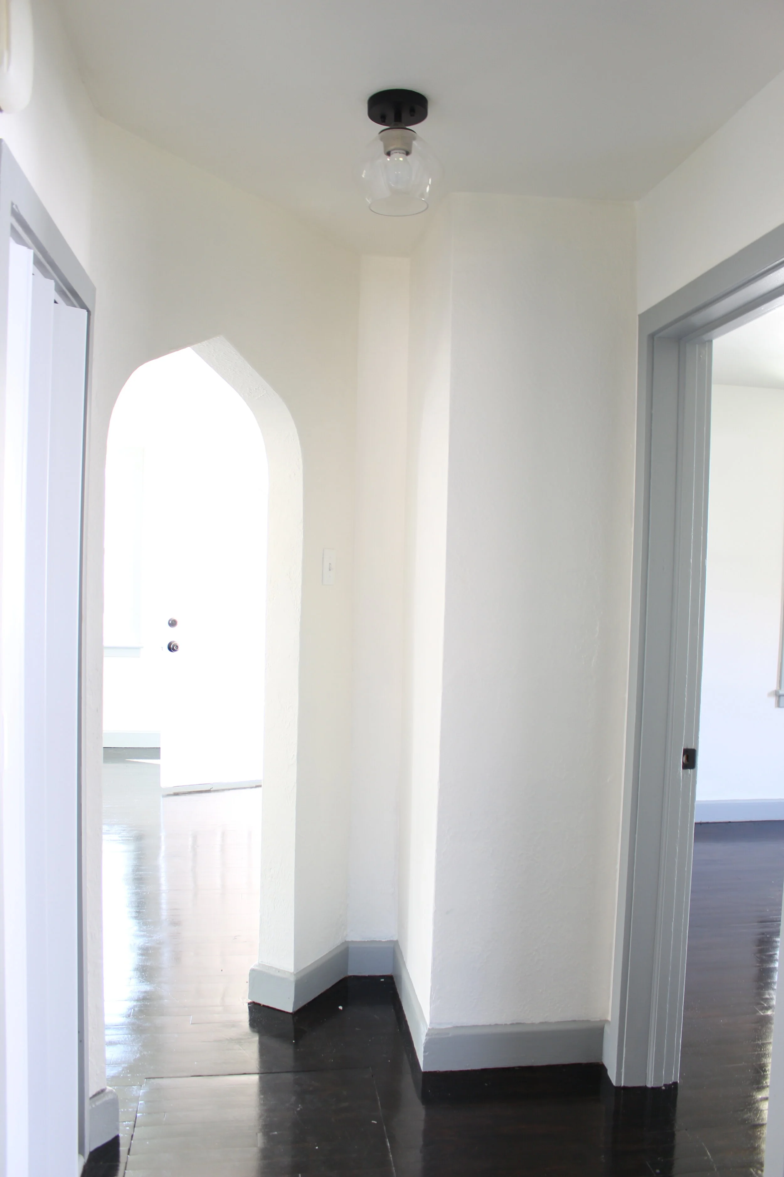
When I first entered the house after we bought it, I noticed immediately that the archways were the old Tudor style, with round edges and points at the top. I wanted to carry the theme as much as I could throughout the house, while still maintaining a modern feel.
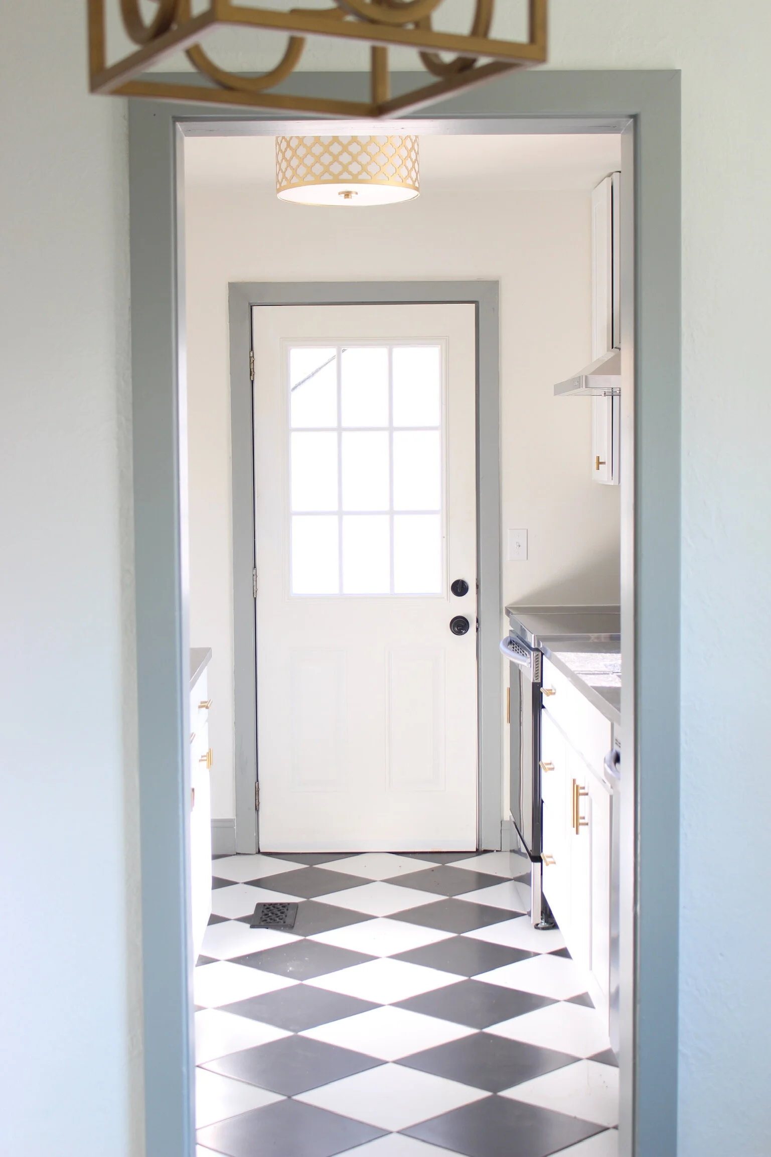
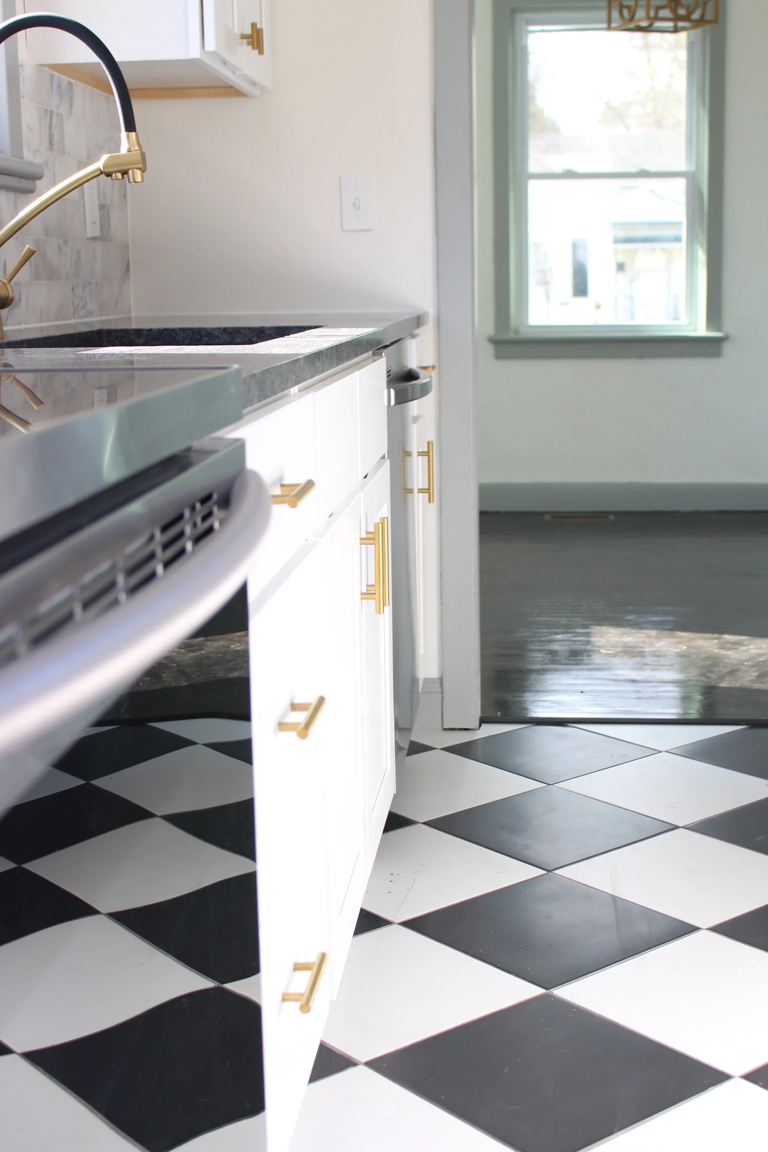
The black and white diamond checkered pattern of the floor sustained a European look that I’d always wanted to try. Personally, I love the character it created in the room, making a statement not too loud yet immensely full of life and charm. The countertop pulled from the floor, and the marble subway backsplash introduced cool grey tones to balance the monochromatic palette of black and white.
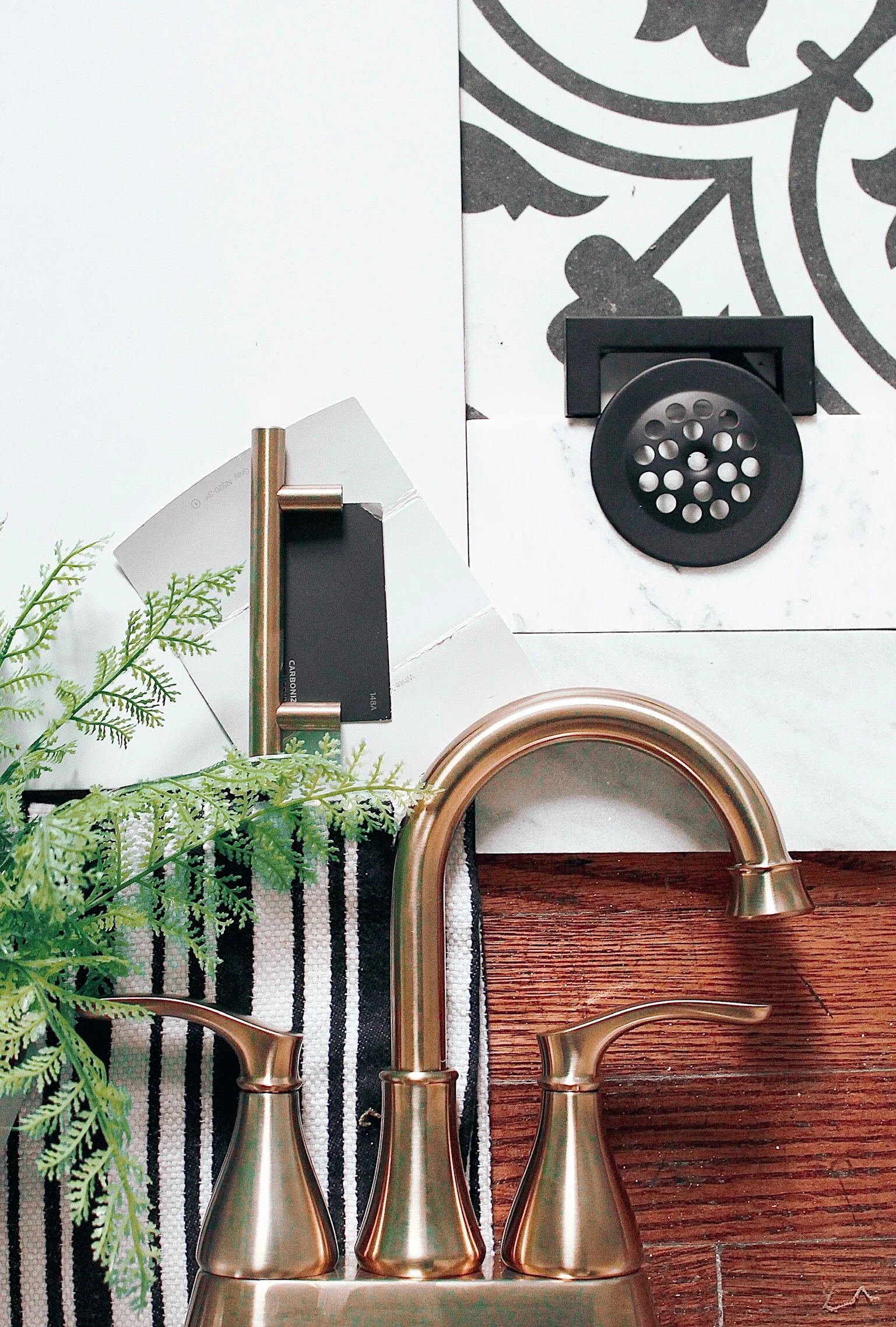
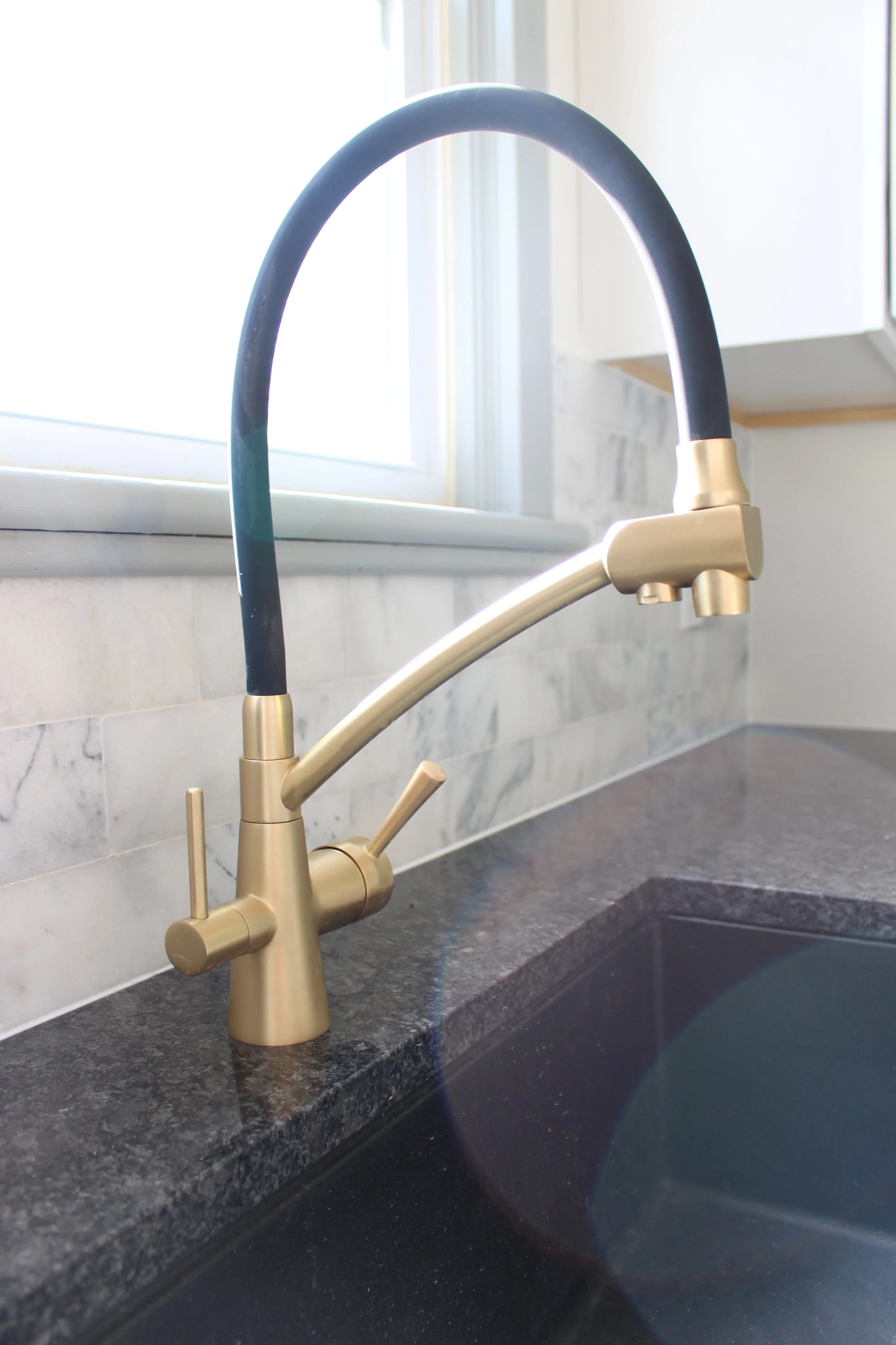
I knew gold would be the fixture color right away. I wanted the warmth of the yellow to balance the cool ambiance and create a necessary warmth that was missing. The gold also gave the darling house an elegant and classy feel, that paired well with the reminiscence of the English Tudor theme.
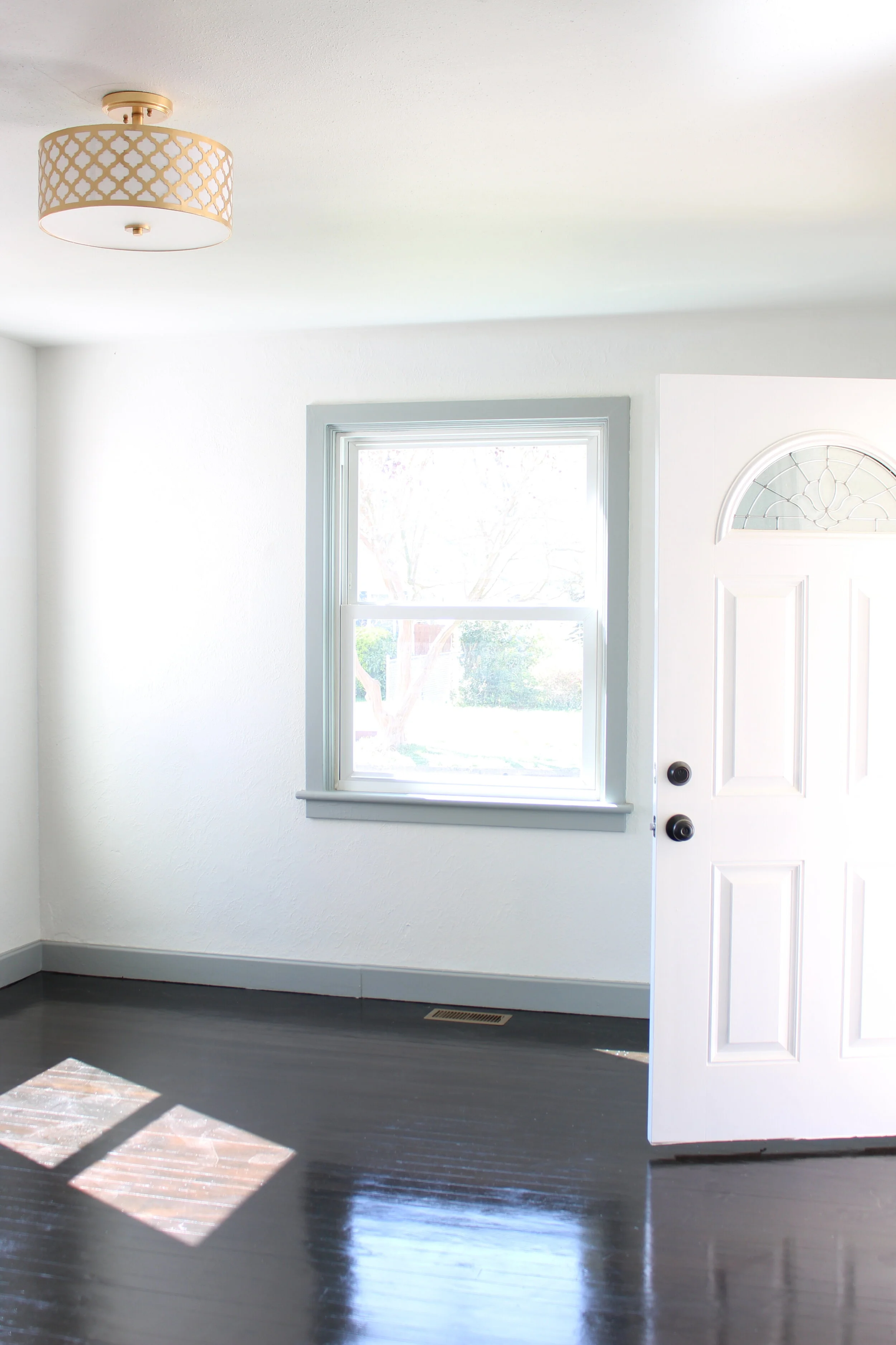
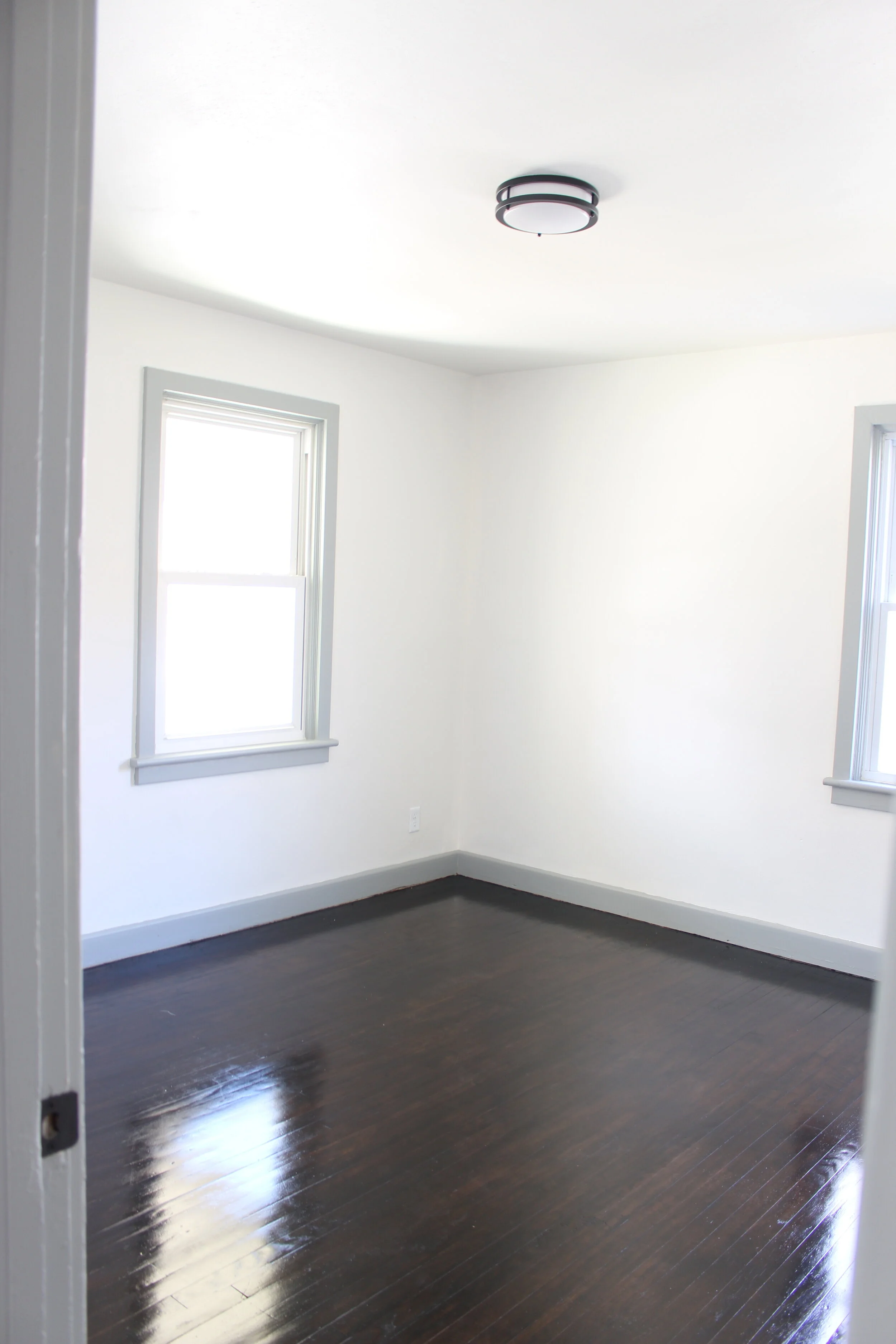
The floors were originally a warm wood to warm up the space as well, but the nail marks from probably adorable, yippy pitty pups were impossible to cover up with the light color. We had to mix Varathane‘s Ebony and Black stain together to create a dramatic dark wood finish, finally hiding the imperfections of the scratches original hardwood floor.
The bold statement it created allowed for well deserved moodiness throughout the home.
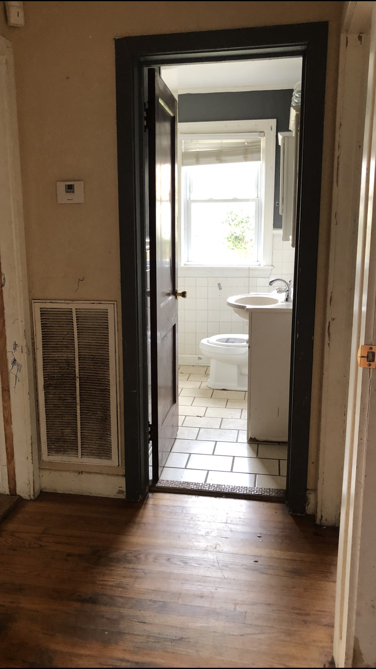
The Bathroom: Sean’s first Tile Job and a Dramatic Accent Wall
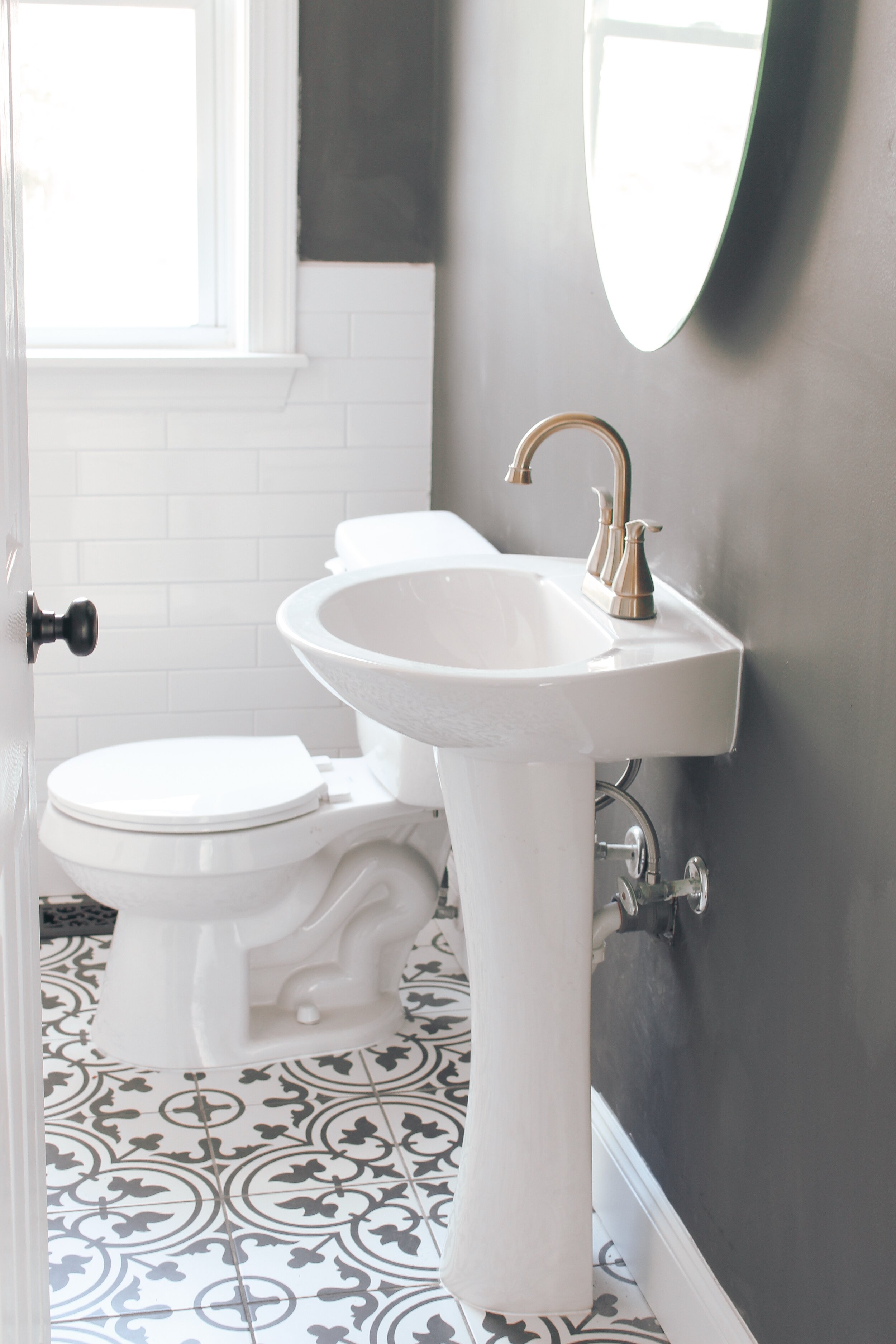
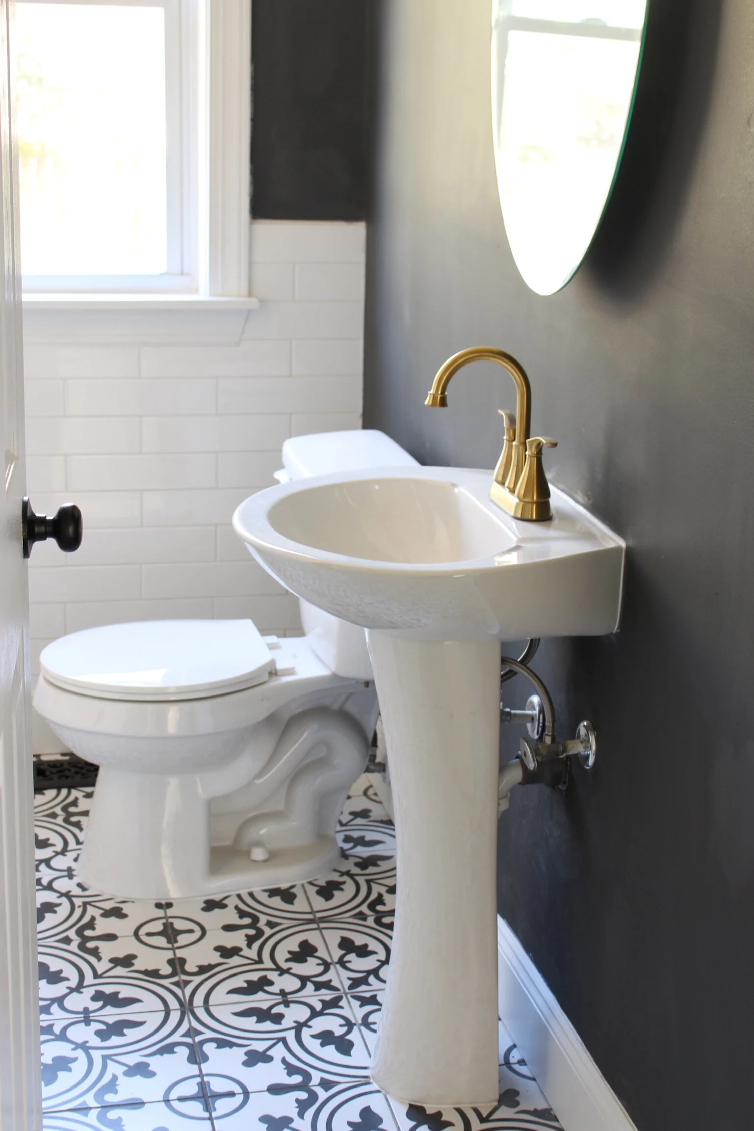
This was Sean’s opportunity to try his hand at tiling for the very first time. He did a fabulous job with the long subway shower tile that flowed beautifully and faded into chair rail underneath the window. Again, he did a cleaner and more crisp job then some people that have tiling for years. I couldn’t be more proud of him.
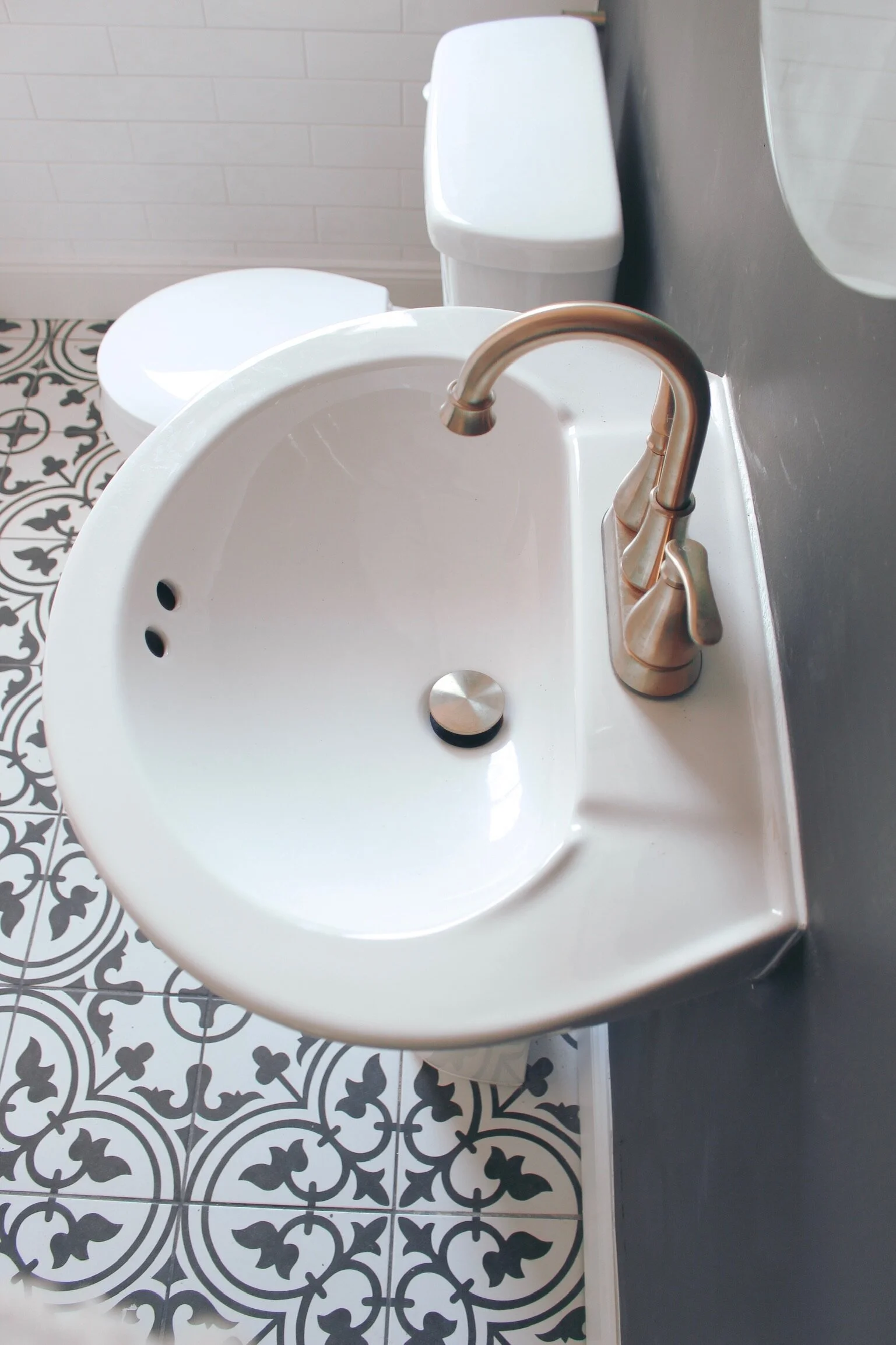
The bathroom layout was trickier than it appeared. The vanity had to be a vessel sink due to spatial limitations, but I thought the standalone piece made the room look and feel more spacious.
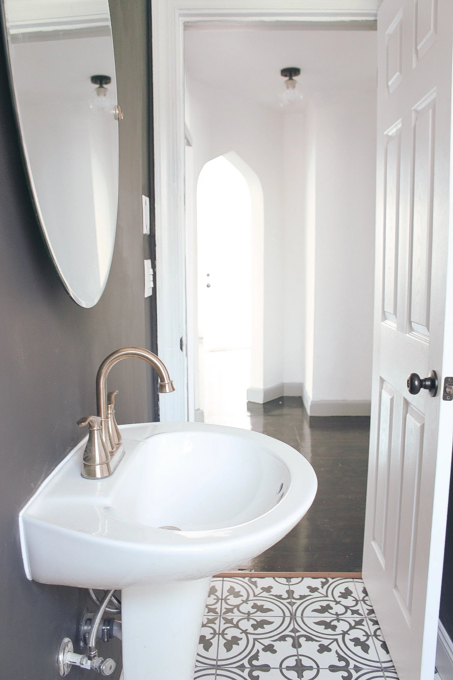
I couldn’t wait to see how the gold from the light fixture, mirror and faucet would bring such a statement to the room. The black of the statement wall was another risk of mine that I had been meaning to just “go for.”
I created a bold backdrop for the gold finishes over the sink, and I couldn’t be happier with the result.
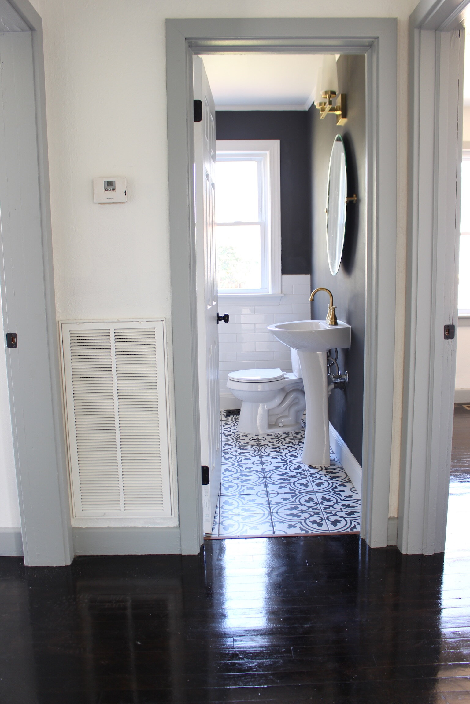
The floor was leftover tile from our Auburn Farmhouse, and it suited this house perfectly. I was pleased with the curvy lines and maturity of the tile’s look, and it is such an eye-catcher when you first walk in.
You can even enjoy it from the front door looking in immediately to the left.
The Bedrooms
The bedrooms all received new flush mounts, and every square inch was painted.
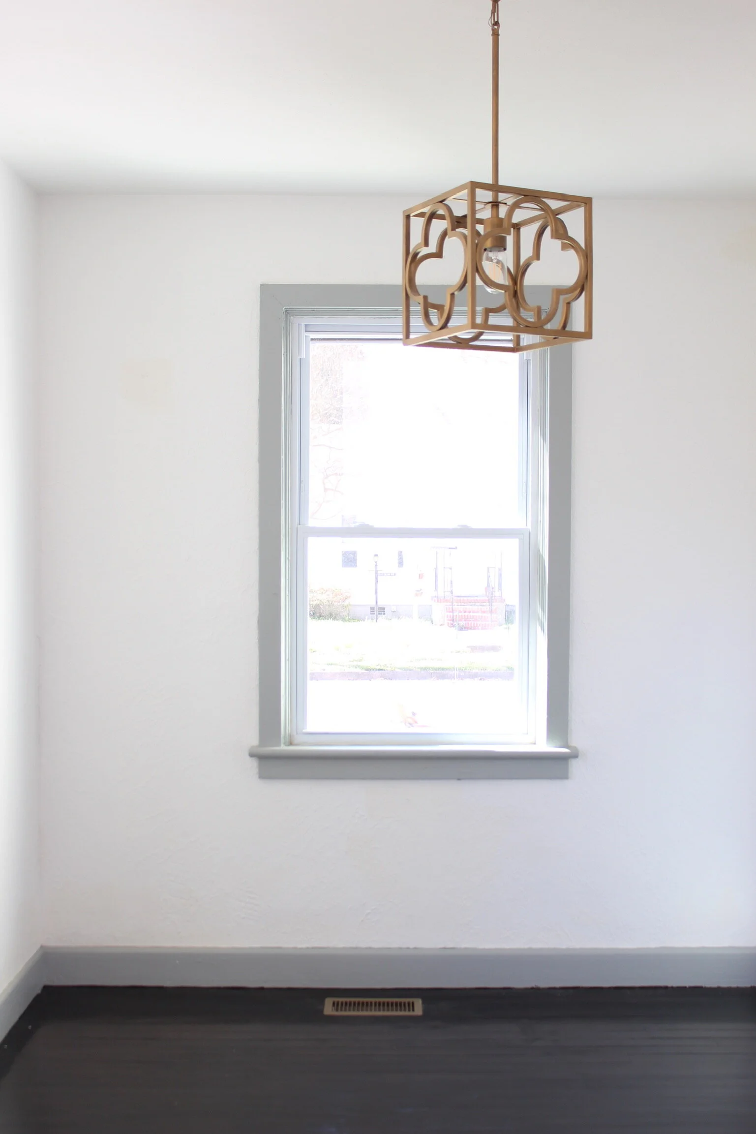
Another trend that fell in line with the Tudor look was the grey trim with white walls. I adore how sweet and unique the overall finish of the “flipped look” turned out. I’m finding in more and more of my research that painted trim with white walls can bring such an original personality to so many homes.
The Outside
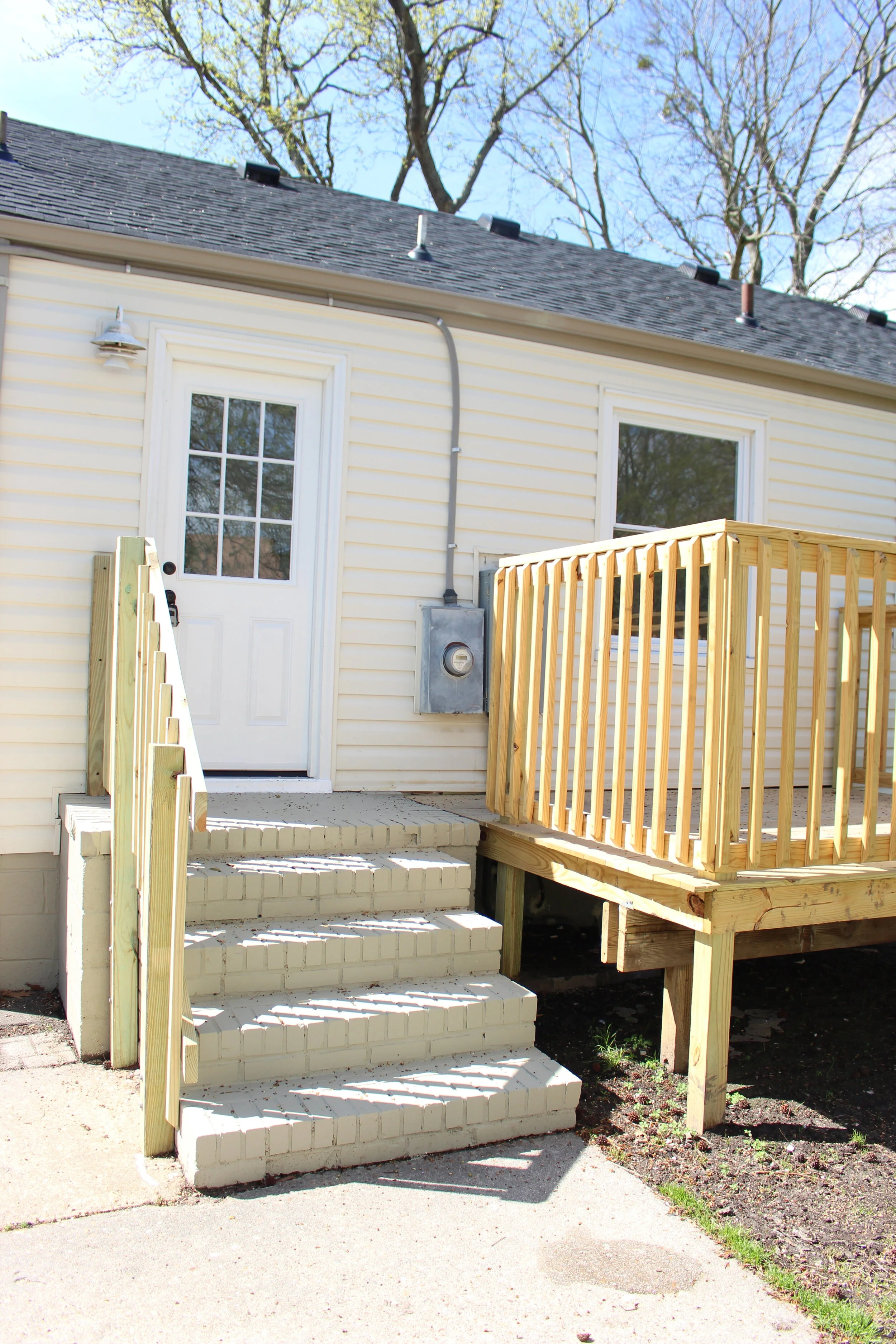
After a power washing session, new mulch, new paint on the front porch, a fixed up concrete slab walkway, brand new garage doors and a brand new deck in the backyard, Gilpin was complete.
We were beyond blessed to field such positive feedback from our realtor and the buyer after purchase. They might as well have said, “Hey kids, keep doing what you're doing and you're gonna be just fine.”
Ann | DESIGN

